A distinct brand identity built on clarity
With Graphmatech’s sophisticated technology, large-scale industrials can make materials like plastics and metals more conductive, sustainable and durable. Our challenge? Translating this potential into a brand identity and website that clearly communicates their high-tech offering to a niche target audience.
Through extensive background interviews and a comprehensive competitor analysis, we developed a brand identity that’s rooted in Graphmatech’s vision to be a frontrunner in commercializing new, more sustainable materials for industrial use.

Black graphene, burnt orange — a powerful visual identity and logo
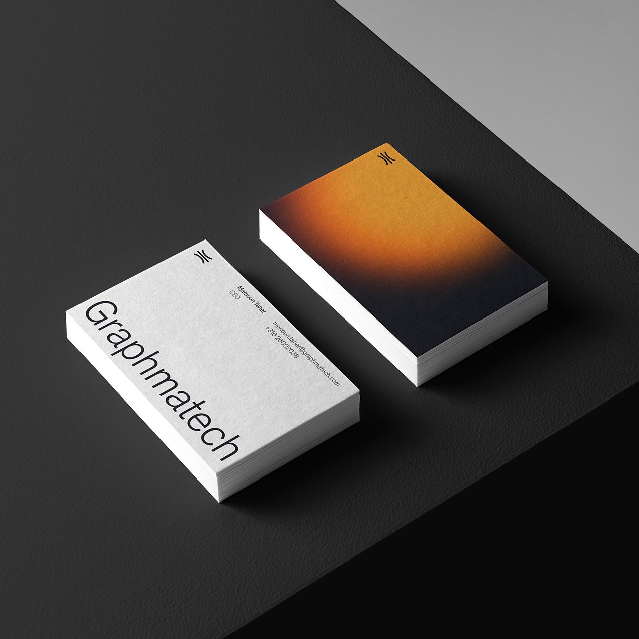
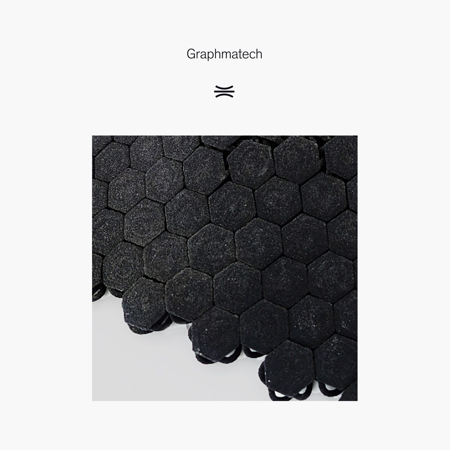
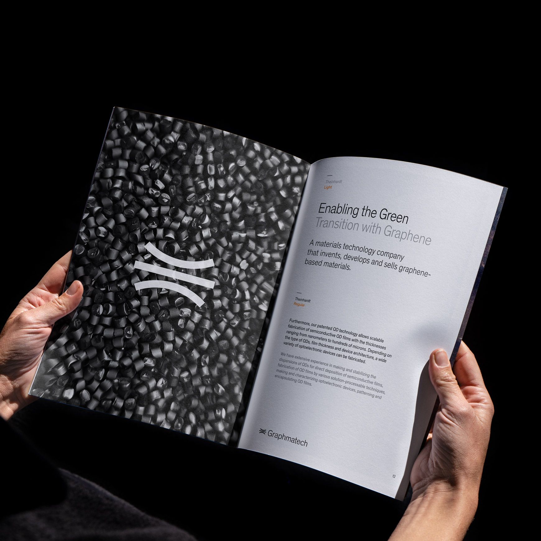
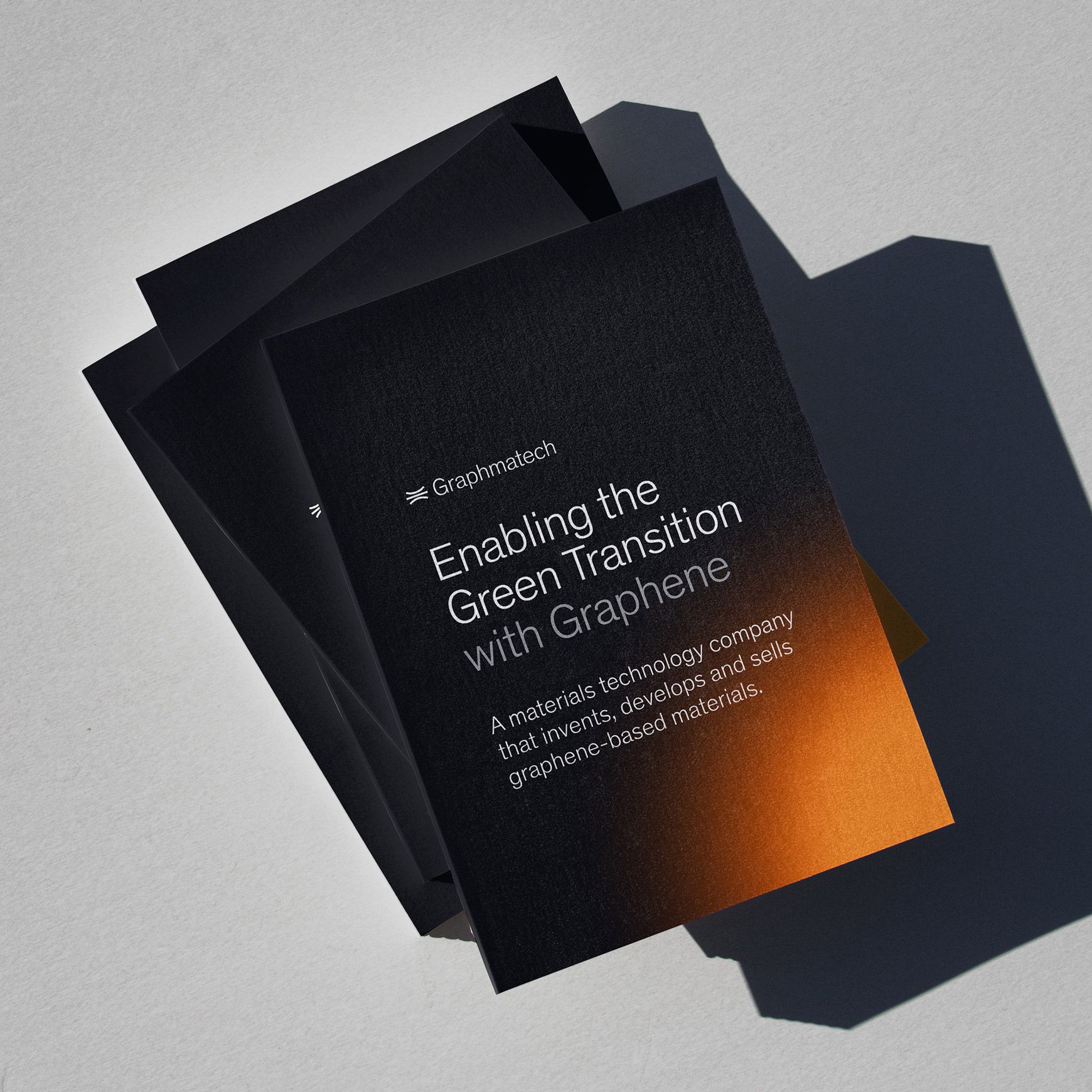
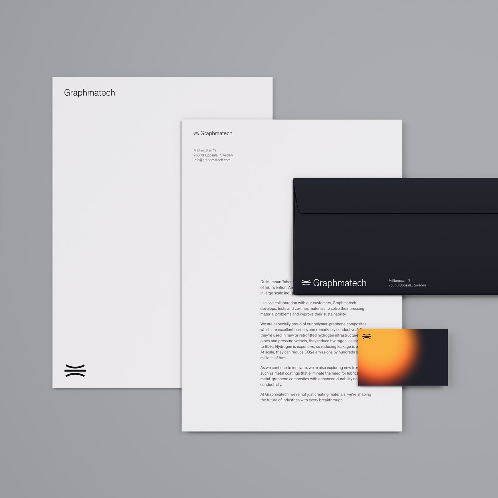
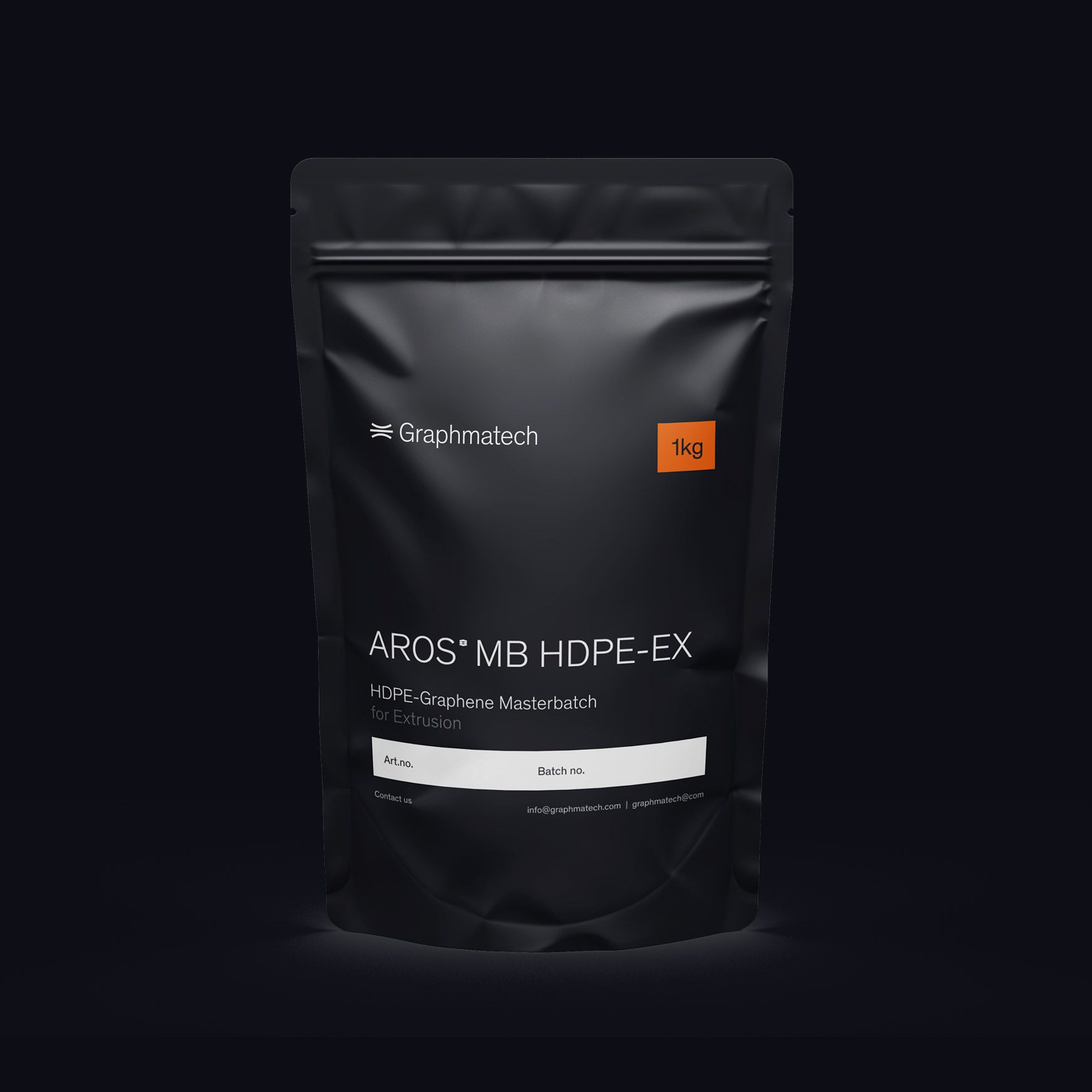
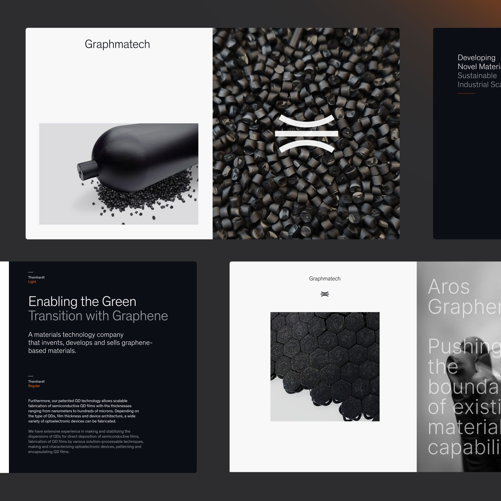
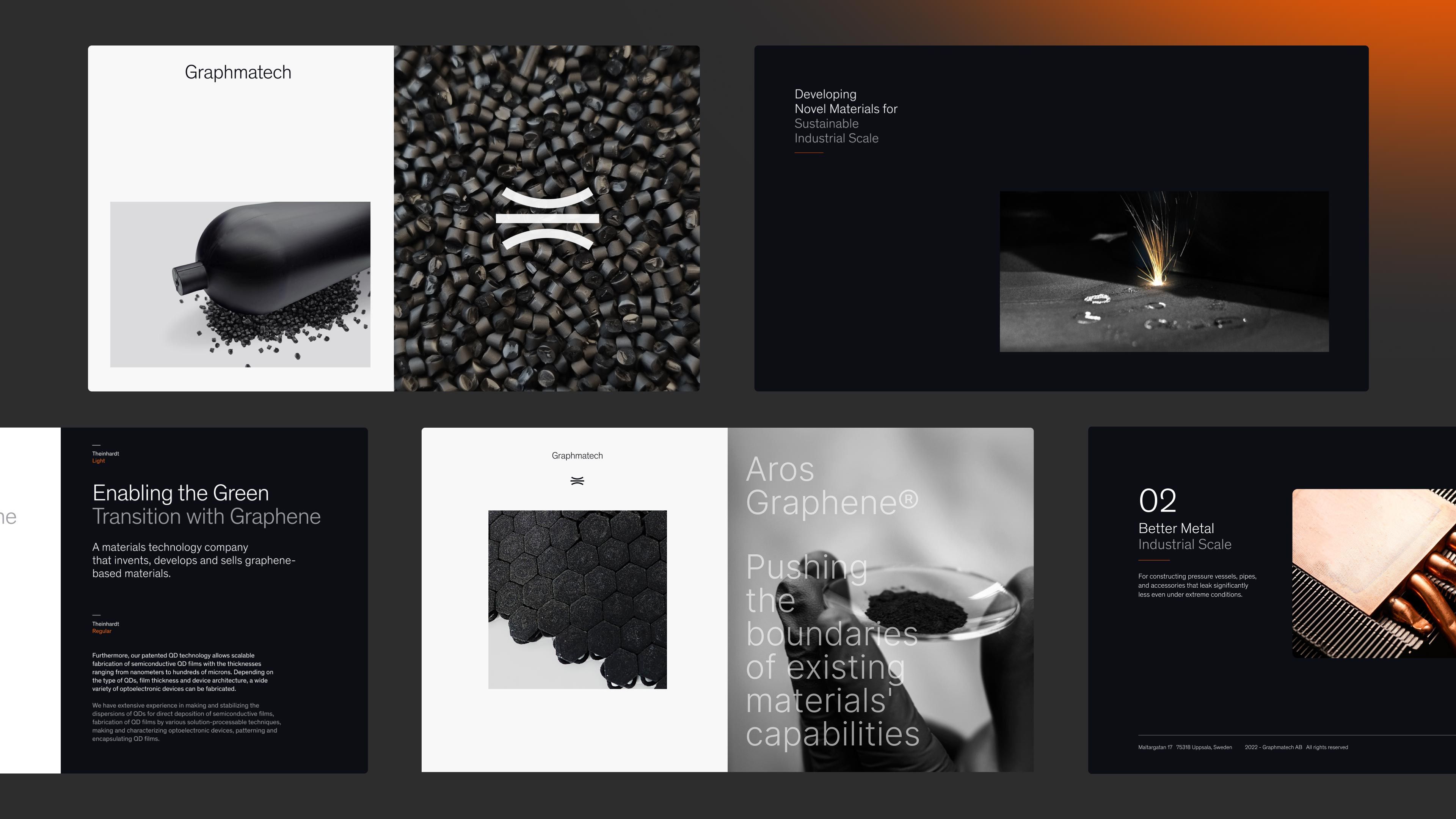
Graphmatech’s visual identity needed to reflect both its scientific roots and its disruptive ambitions. The result is a sleek and premium aesthetic that juxtaposes graphene’s deep black hue with a striking burnt orange highlight. The minimal yet functional design makes a strong statement in an industry that often plays it safe.
The new logo – a sans serif text logo coupled with a floating layers symbol – is not only visually appealing, but also functions harmoniously across various applications. The symbol is a subtle ode to Graphmatech’s revolutionary technology, inspired by their ability to fix the long-standing agglomeration issue in graphene applications by keeping graphene layers separate. The fluidity of the symbol captures a lightness and hopefulness that the company has for the future of industry as more and more sustainable graphene-based applications make it to commercial scale.
Clear positioning and customer-focused copywriting
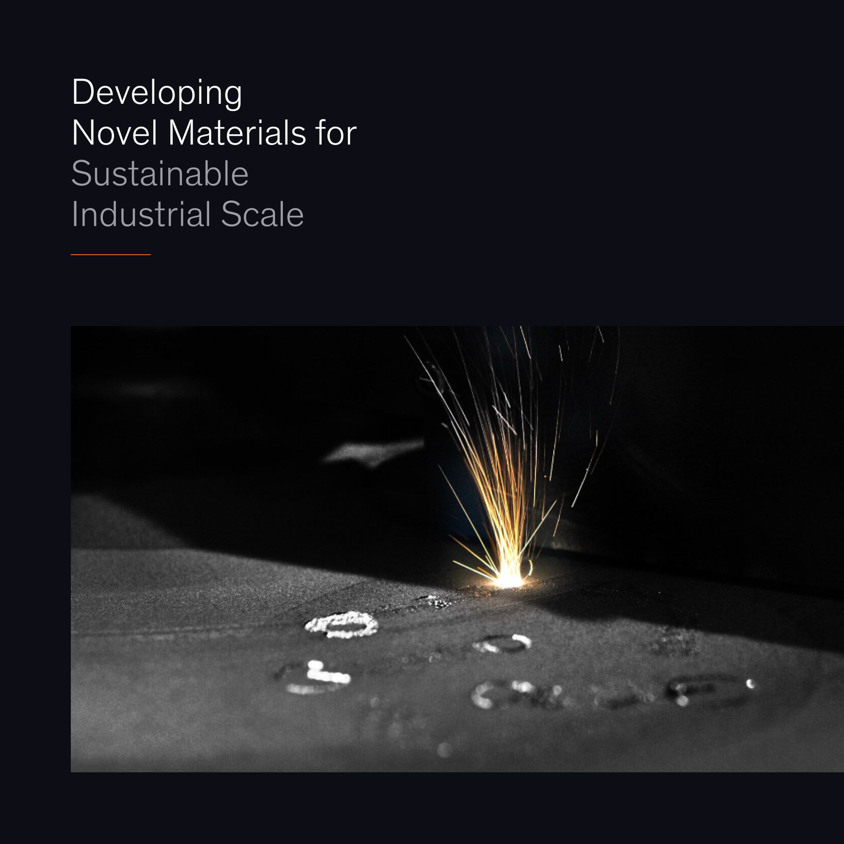
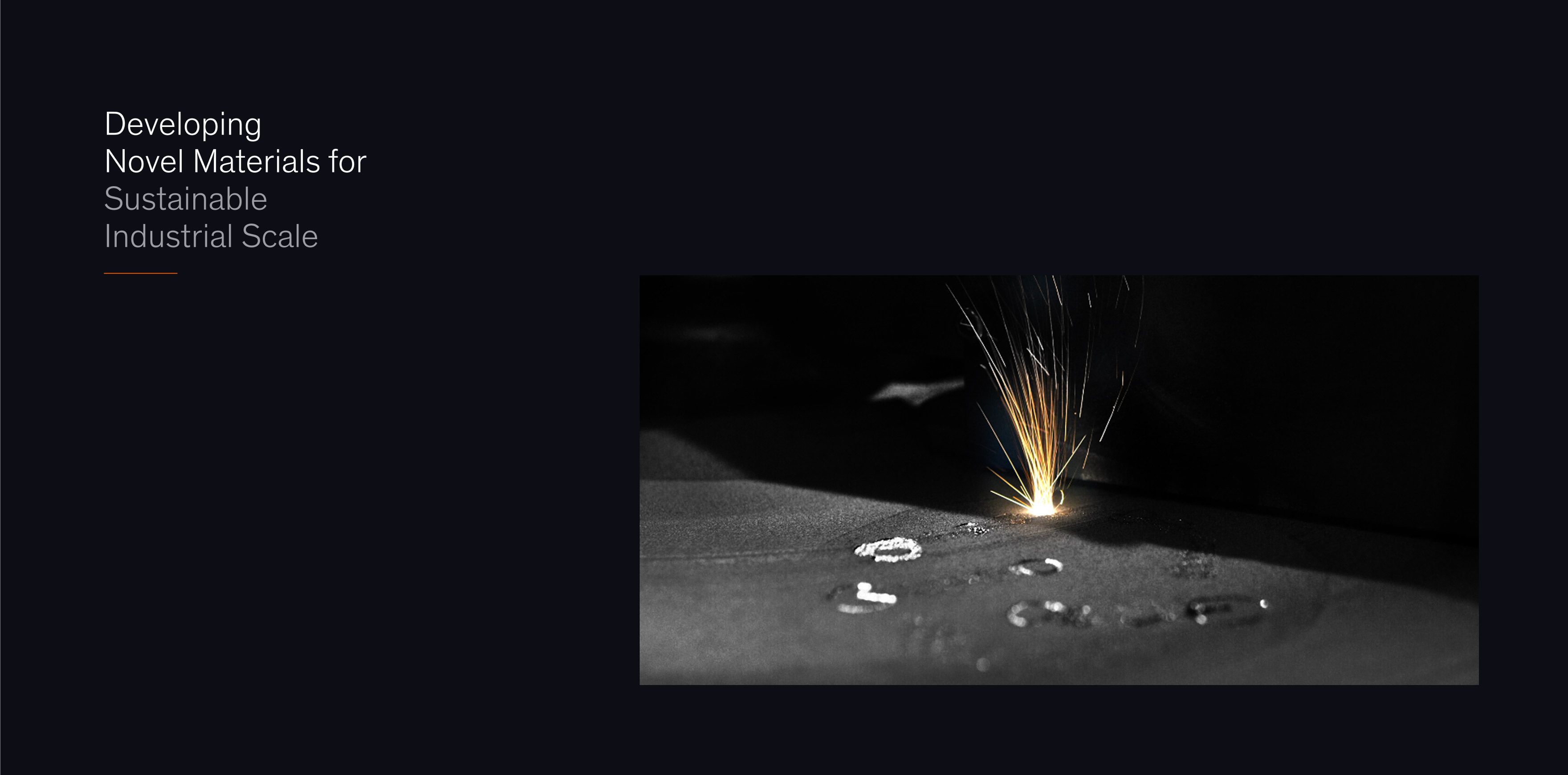
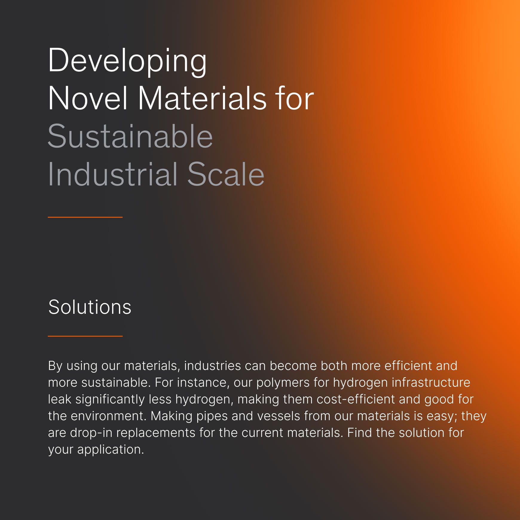
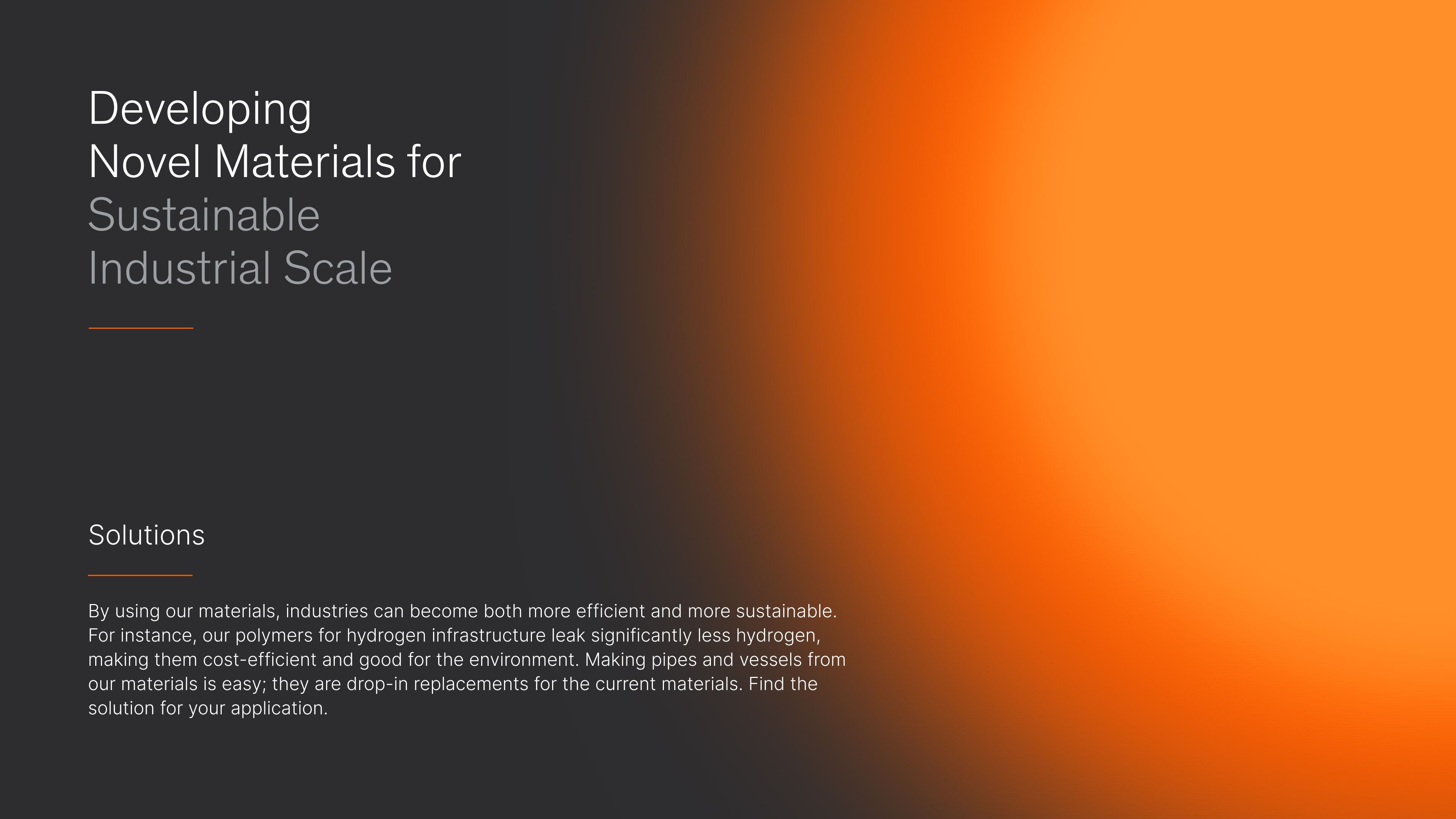
Graphmatech’s matter of fact positioning – developing novel materials for sustainable industrial scale – highlights their shift from an R&D phase to a strong, commercially viable deeptech company.
Finding the perfect balance between scientific precision and accessibility required copywriting in its highest form. The copy steers clear of dry, hyper-technical jargon, and instead, focuses on clear storytelling that speaks directly to potential customers. It shifts the conversation from theoretical lab environments to real-world applications: what Graphmatech can deliver today, and how customers can integrate it seamlessly into their operations.
A new website to cater a seamless digital experience
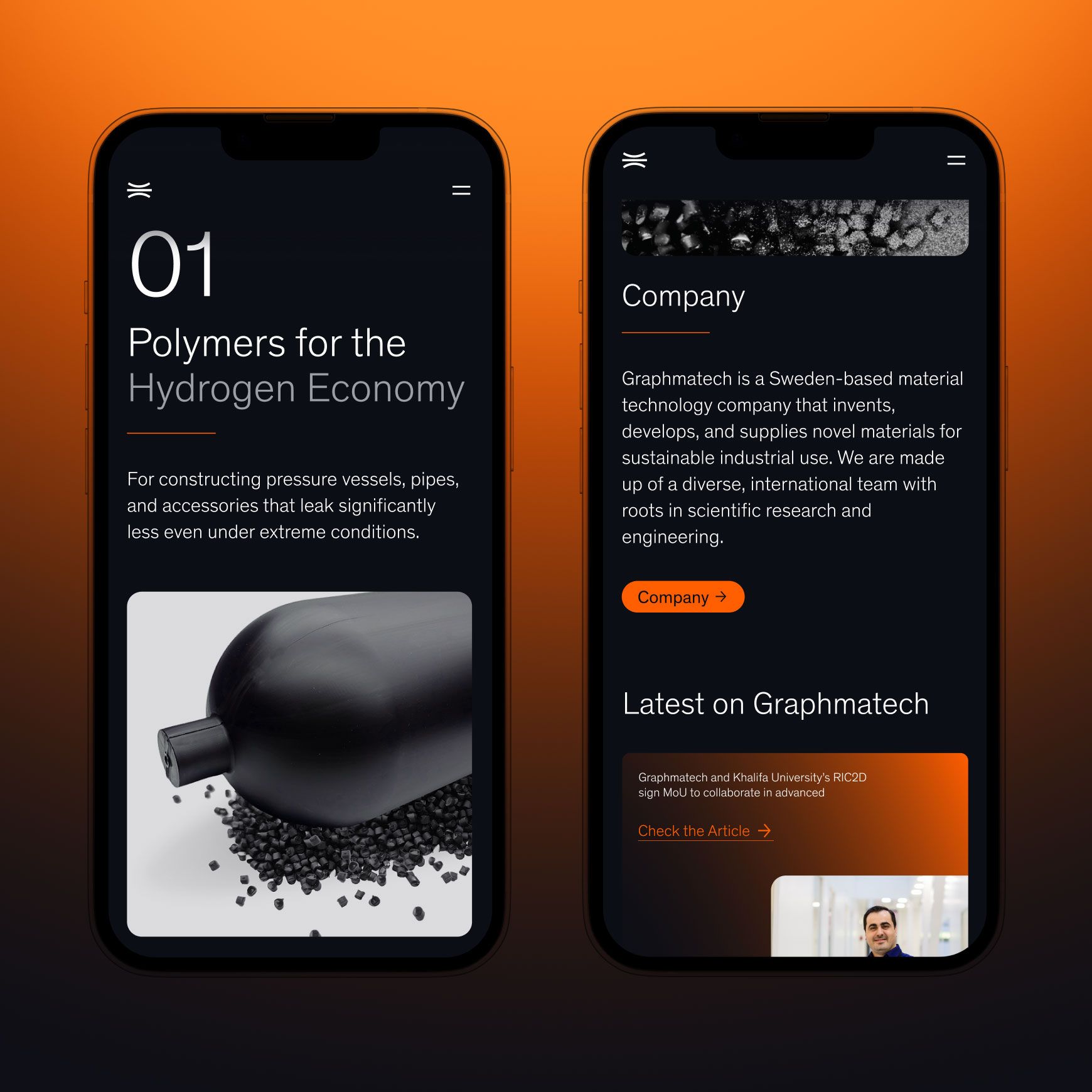
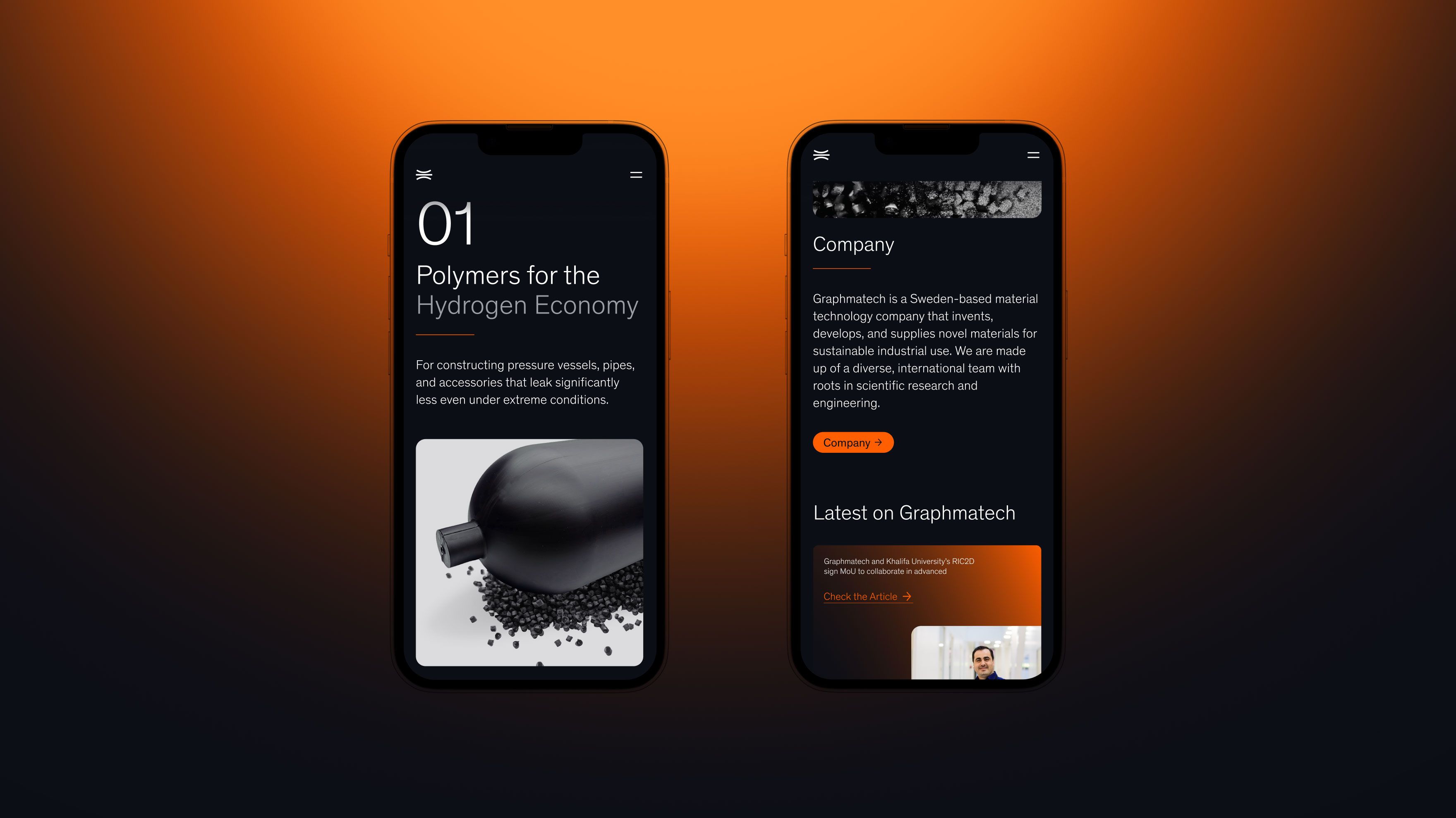
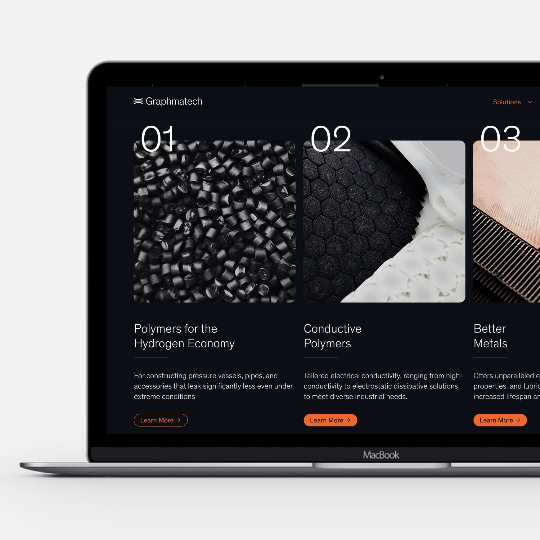
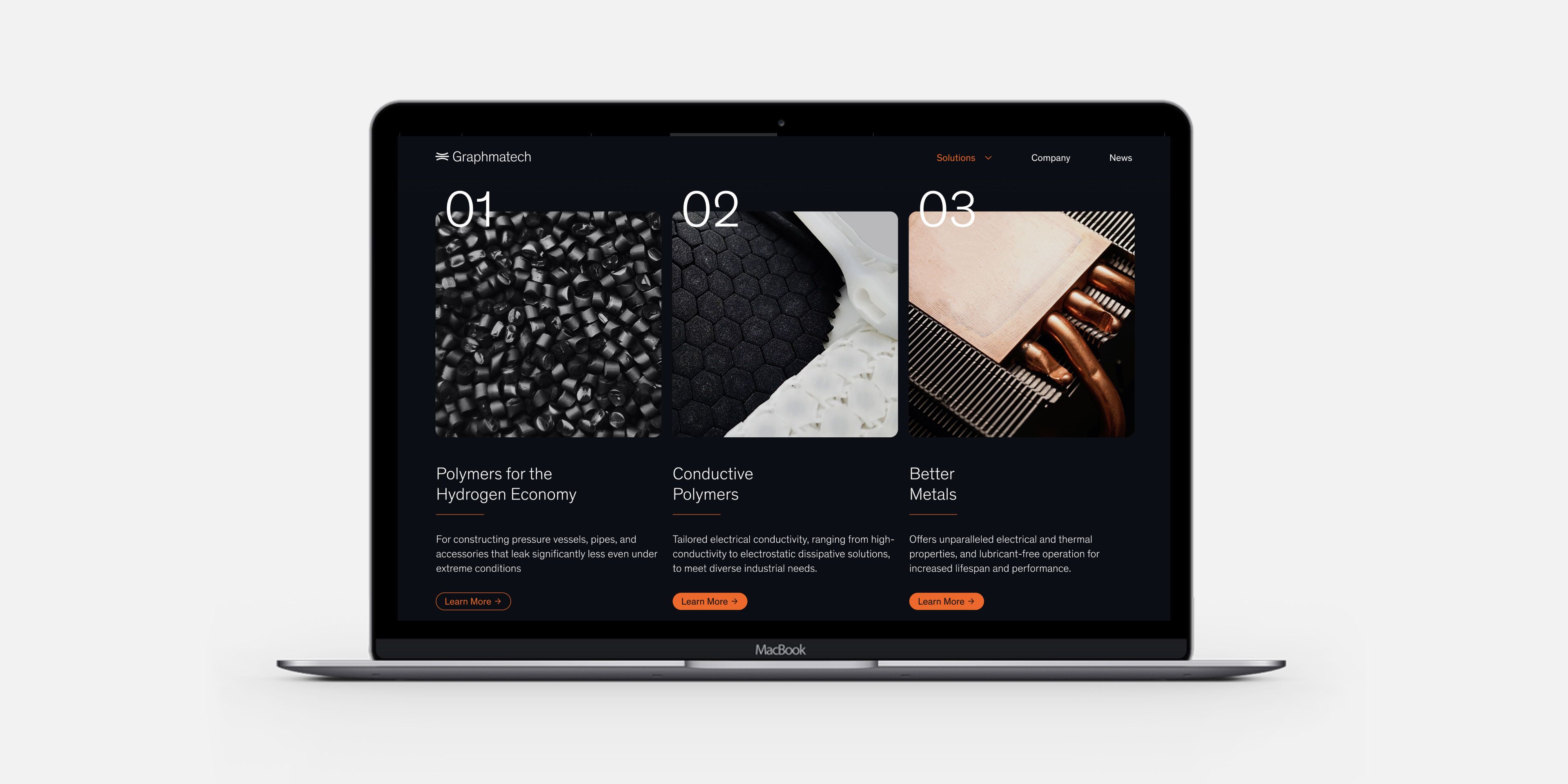
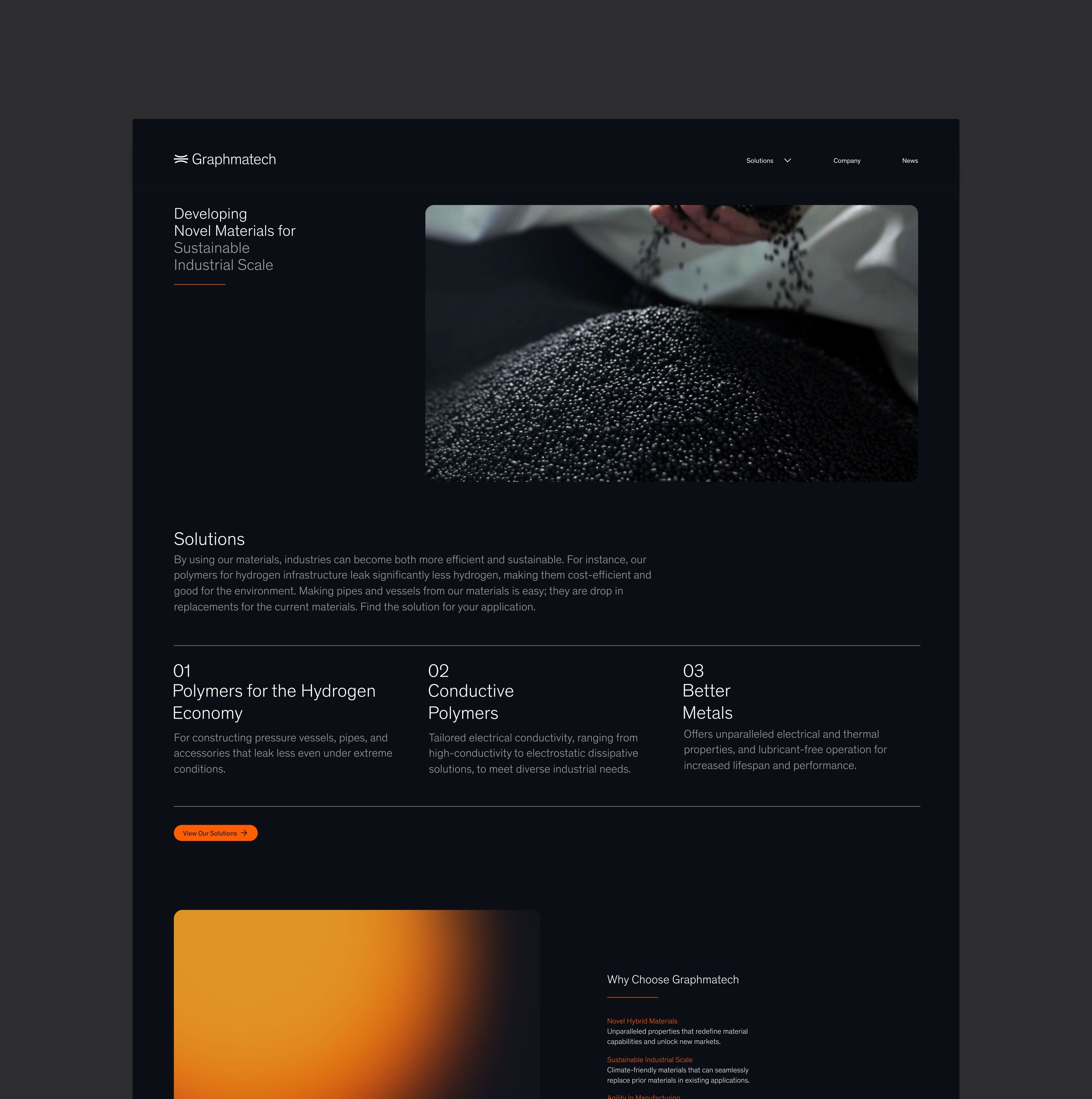
Every element of Graphmatech’s website was designed with the user and new positioning in mind. Conversion was the starting point for information architecture and content structure – thus, applications and product benefits are front and center, ensuring that potential customers quickly understand how these advanced materials can transform their industries.
Industrial imagery is used to highlight both the sophistication and the real-world impact of Graphmatech’s materials, turning even ordinary objects into awe-inspiring visuals. The seamless UX guides visitors effortlessly, reinforcing the message that innovation doesn’t have to be complex. Subtle animations and hover effects bring a premium feel that again, elevate the brand and position it more as a high tech than a manufacturing company.
