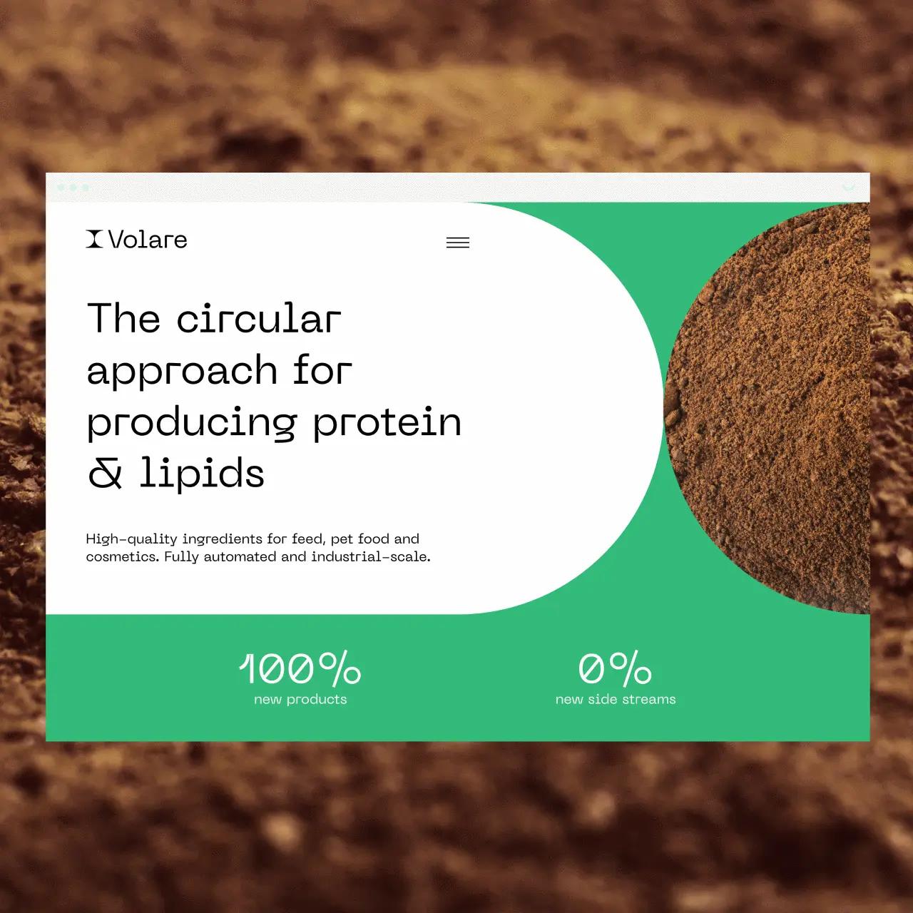
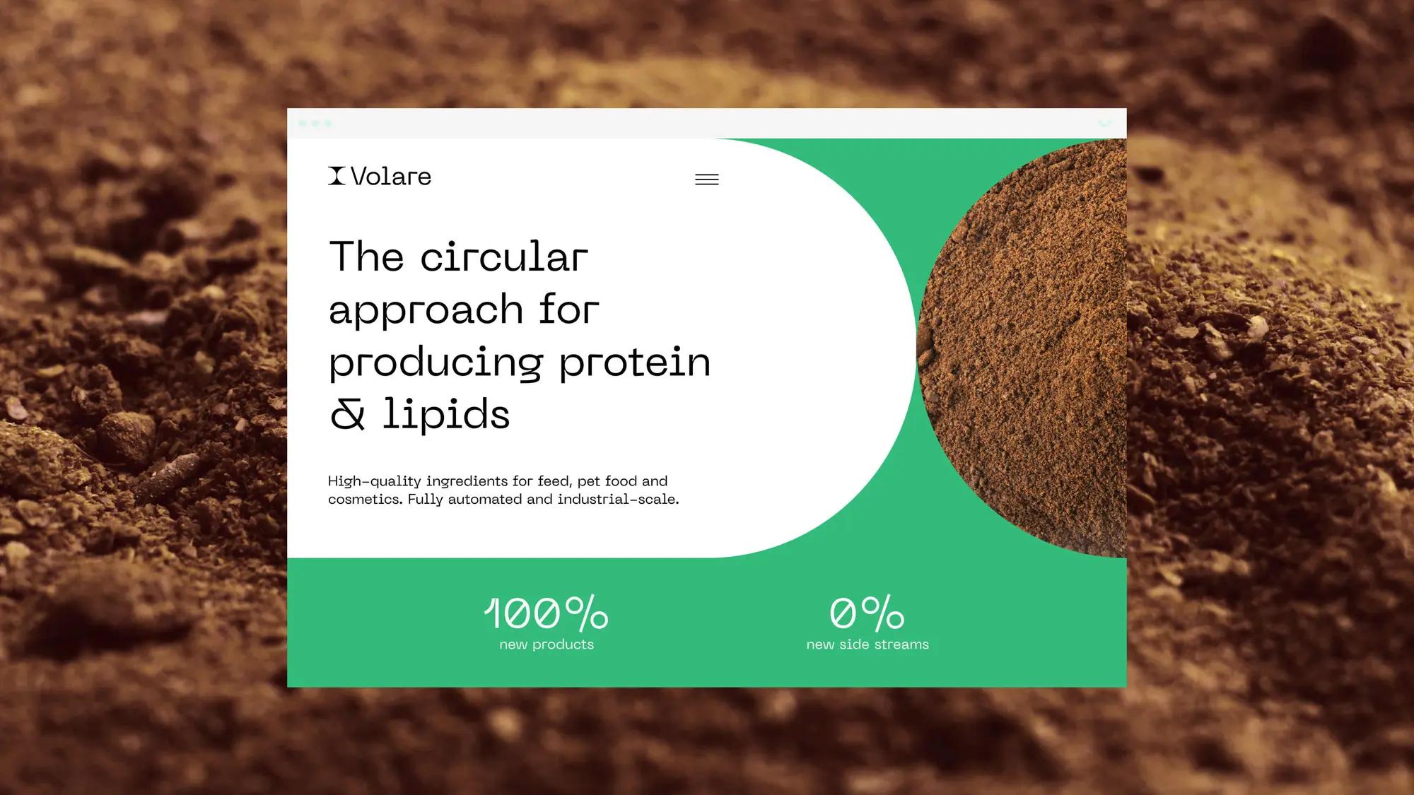
Launching a pretty fly brand from scratch – with circularity at its heart
Starting with only a name, we delivered a full brand identity package – from competitor analysis and brand positioning to visual identity, key messaging and website development. It’s all tied around Volare’s 100% circular approach, forming a beautifully coherent brand to stand out with.
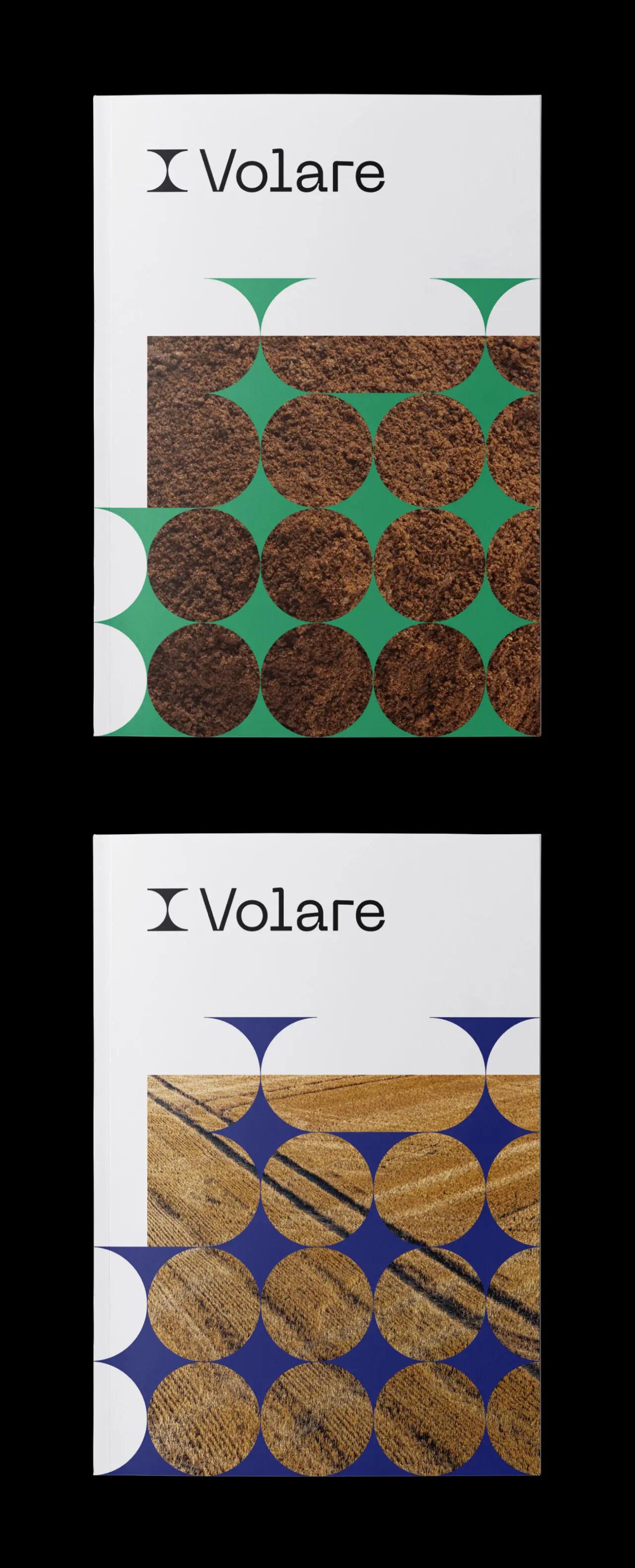
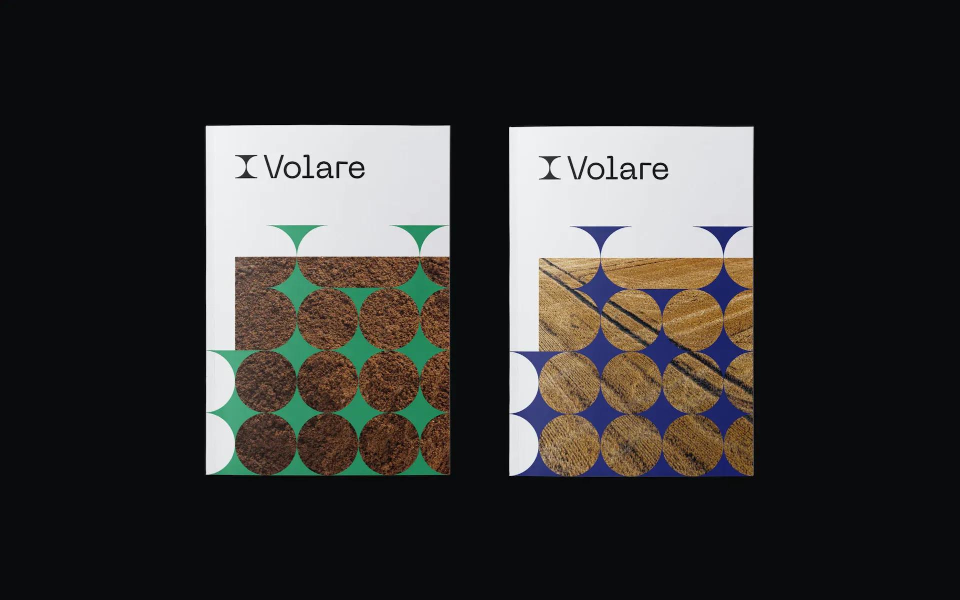
A visual identity as circular as Volare’s approach to product development
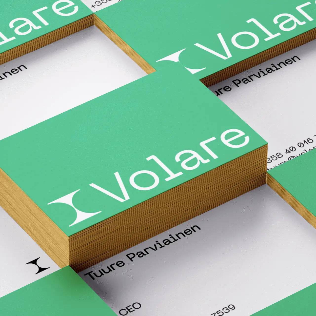
Volare collects food industry side streams and creates new raw material – without creating any side streams itself. So, we designed their logo and illustration patterns inspired by this loop. Circular shapes, organic typography and a symbolic color palette all pay homage to Volare’s groundbreaking circularity technology. Their visual identity effortlessly scales with the company, who’ll soon rub shoulders with industrial giants.
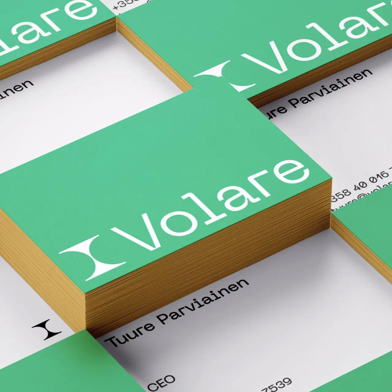
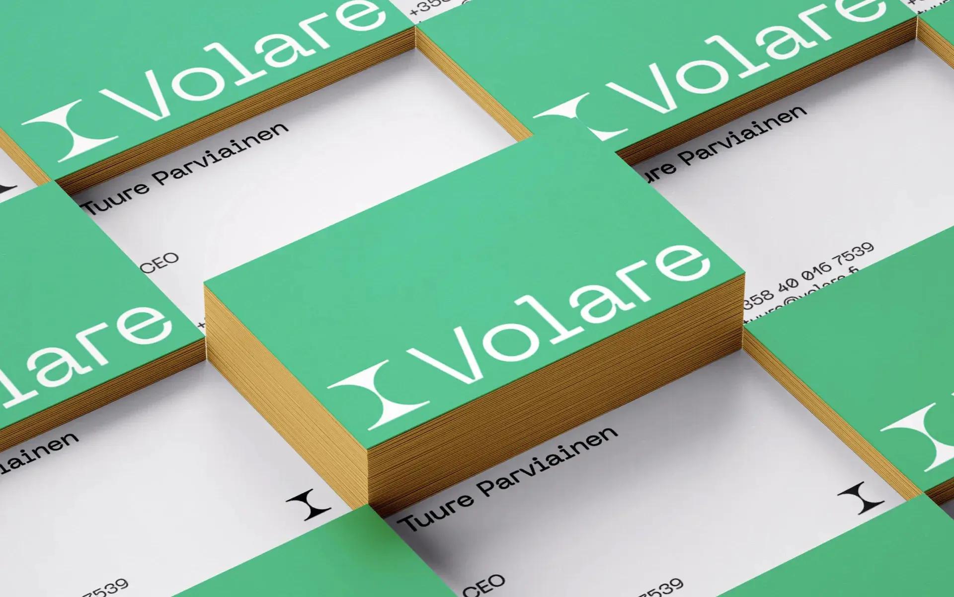
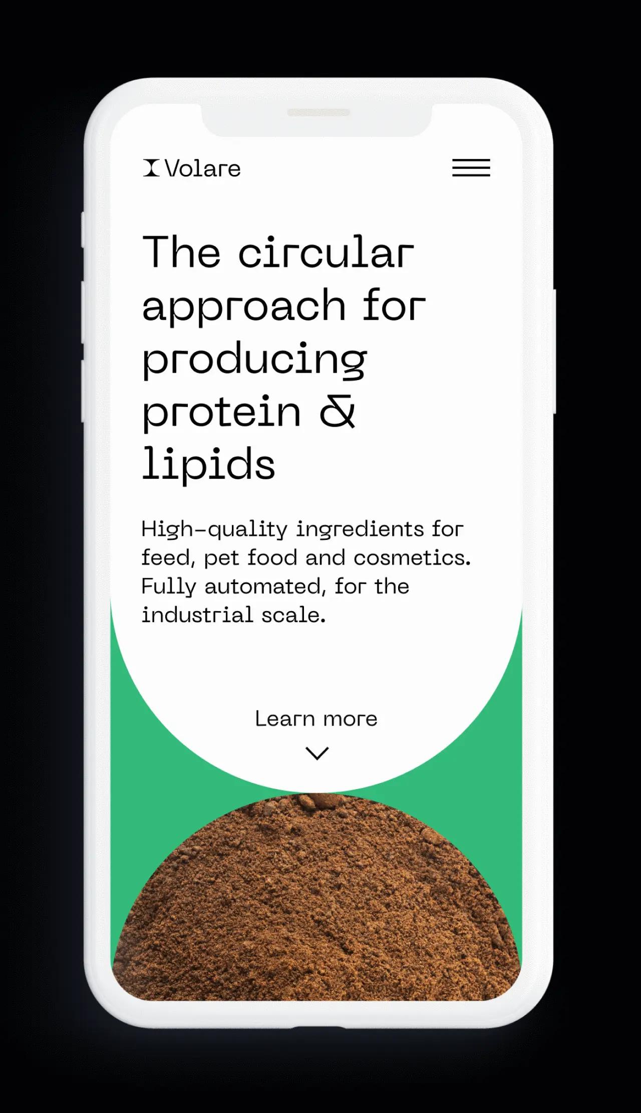
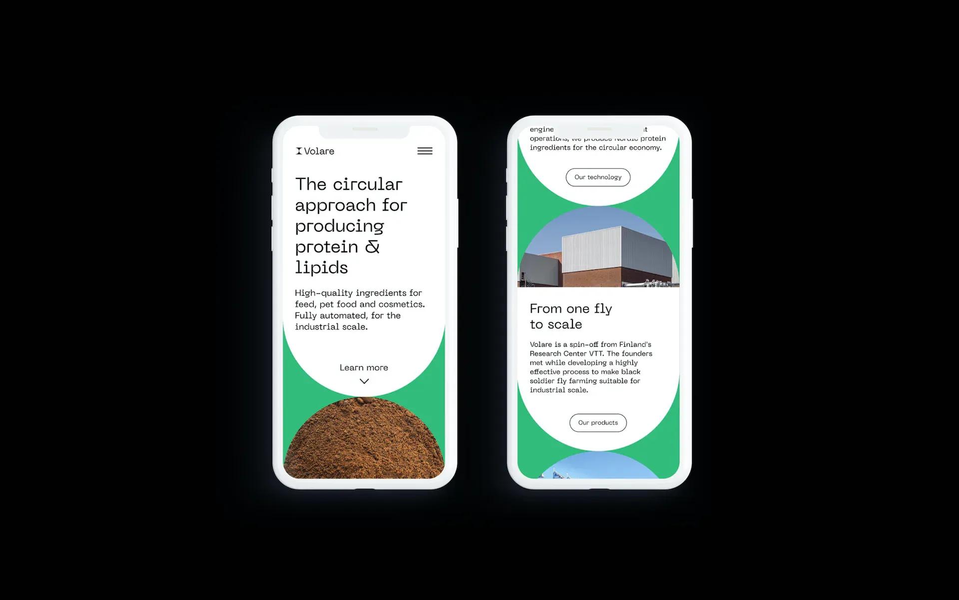
A striking website and sharp key messaging to outline the company’s vision
Volare’s work is deeply rooted in complex science and technology but their website we kept simple. Our conscious decision to steer free from jargon allowed us to opt for very, very, very clear messaging that’s easy to digest. From a technical perspective, Typescript and Next.js keep the website up and running smoothly like Volare’s production line.
