Carner


Carner is one of Finland’s leading corporate finance houses with 54 partner offices in 38 countries. The name stems from cornerstone – and coming up with it was the first step we took together in 2019. Back then, we gave the brand a proper uplift for the new decade.
Services
- Naming
- Visual identity
- Web design
- Team extension

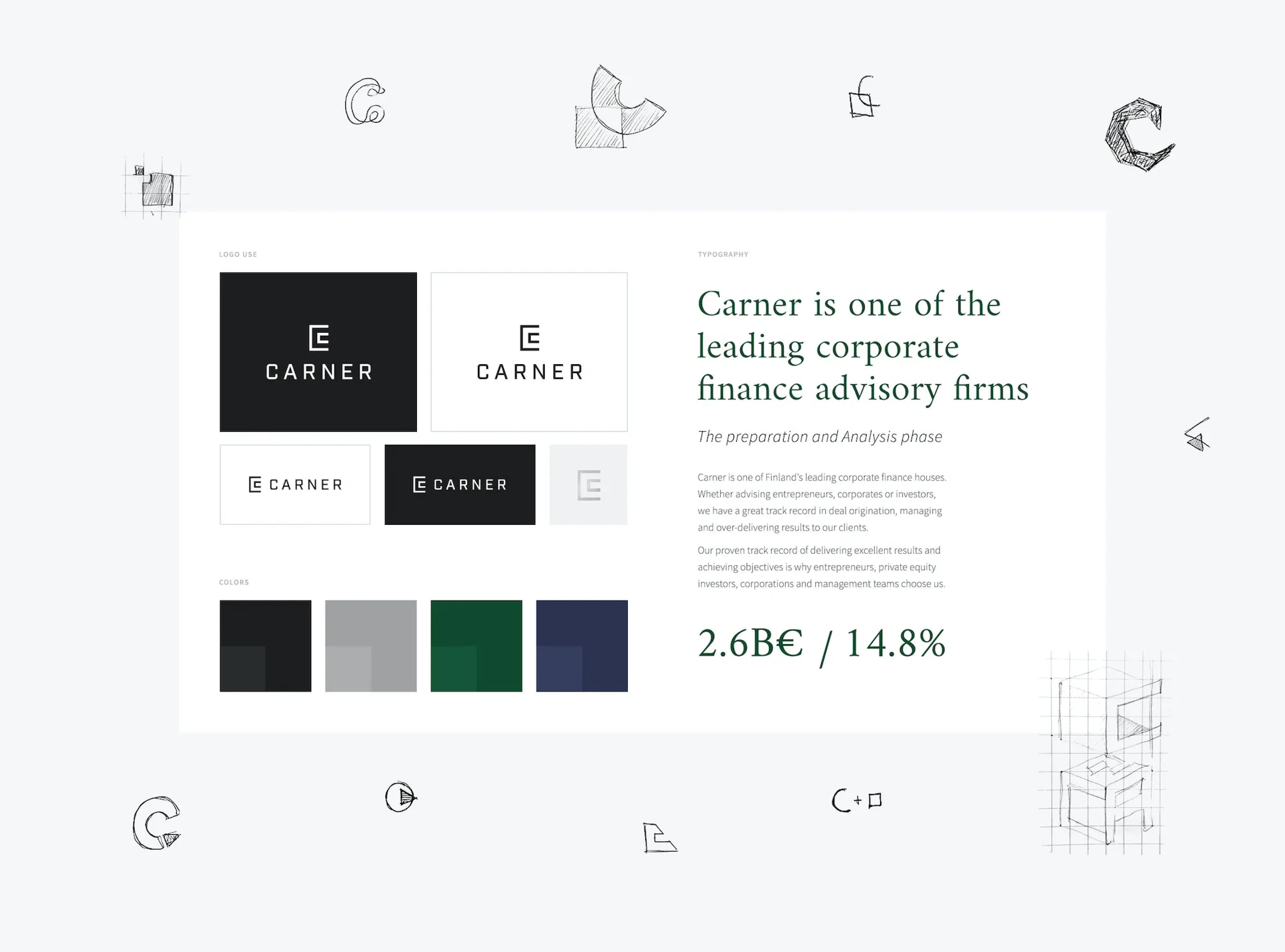
After choosing the name, we gave a proper uplift for the brand’s visual identity.
The new name was to represent long-term companionship, perseverance and stability without being stuck-in-time. The meaning of cornerstone checks all these boxes. Drawing from that idea, Carner carries the same fundamental vibes while sounding dynamic and iconic.

After choosing the name, we gave a proper uplift for the brand’s visual identity.
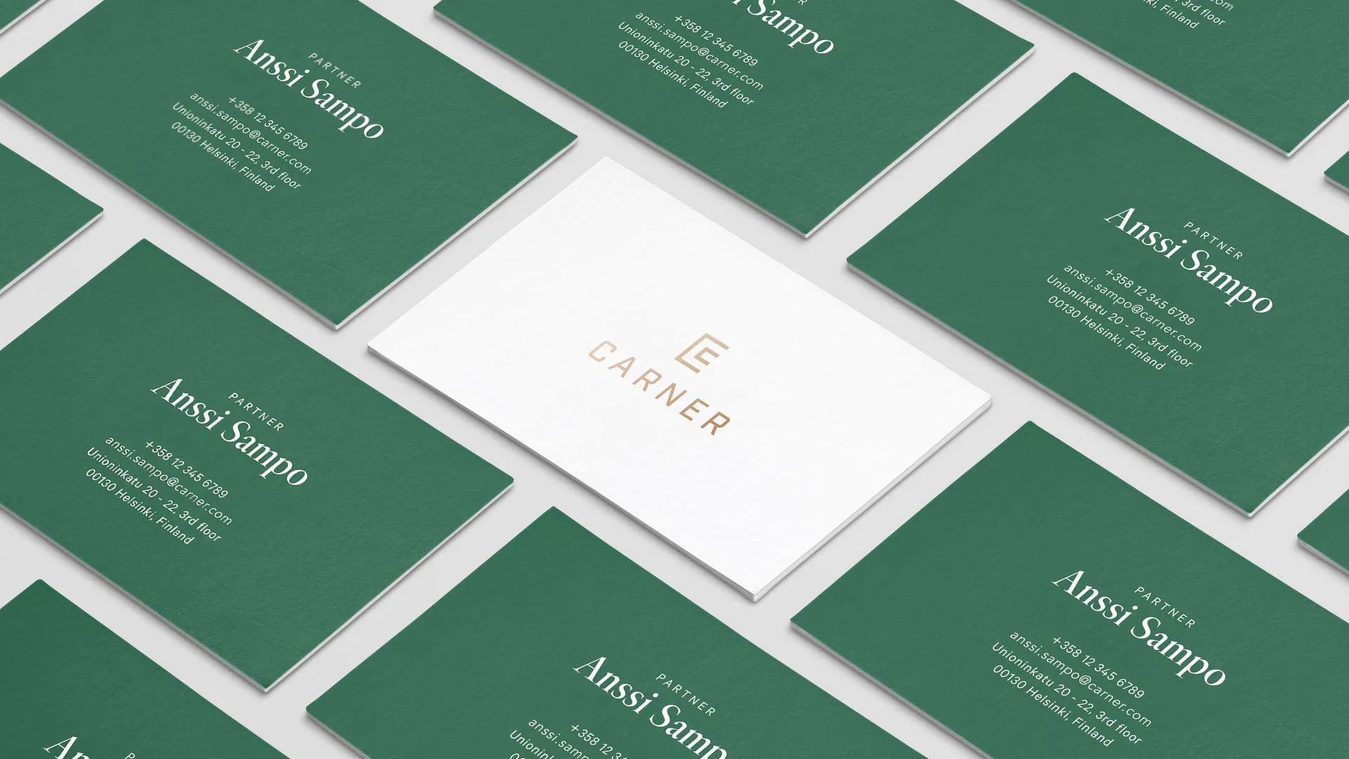
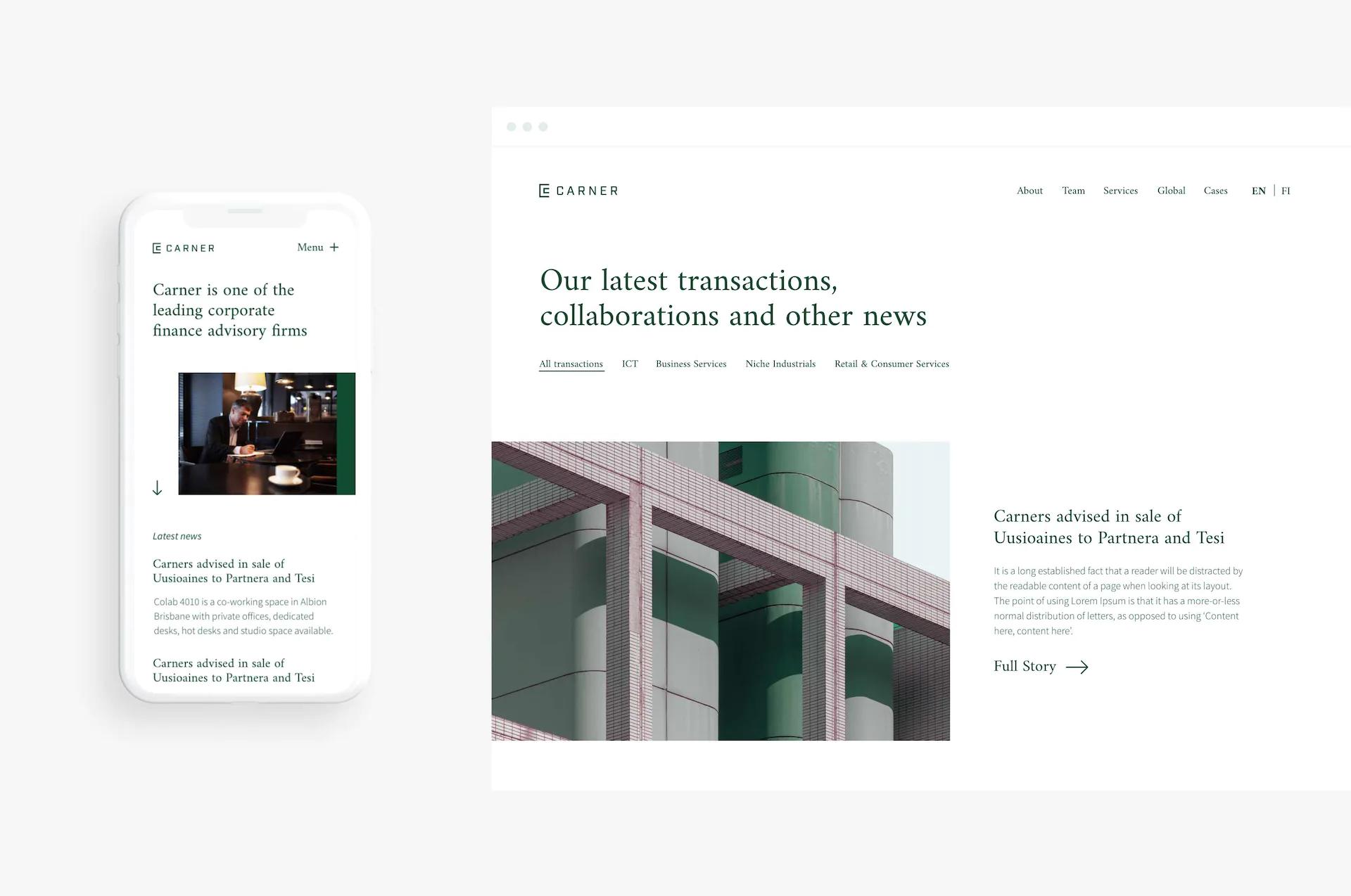
The logo stems from the cornerstone idea and the unconventional serif font supports it nicely. Primary brand colours and the golden warmth of the photography concept highlight timeless trust. The strong use of white space refreshes the final look. A credible identity, indeedo.


