Cherry

Cherry is a European VC firm with offices in London, Berlin, and Stockholm – and first-hand experience in building companies like Spotify, Uber, and Zalando. Cherry picked us, and this is what happened: a complete brand identity redo, from strategy and visual & verbal identity to a full-fledged website, brand photography, and collateral design.
Services
- Brand renewal
- Brand strategy
- Brand identity
- Visual identity
- Art direction
- Photography
- Verbal identity
- Copywriting
- Website design
- Website content
- Website development
Brand renewal for an iconic European VC
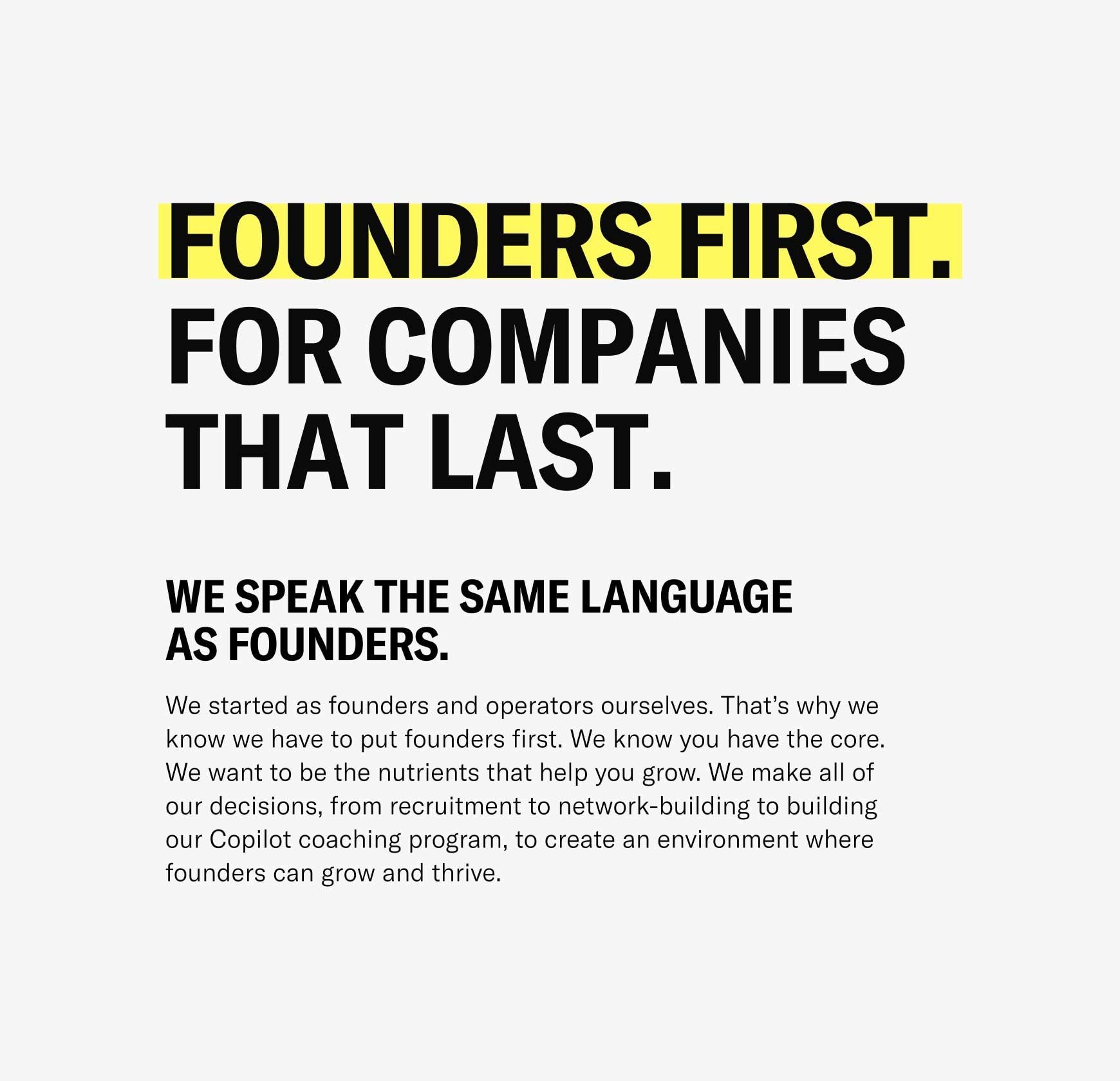
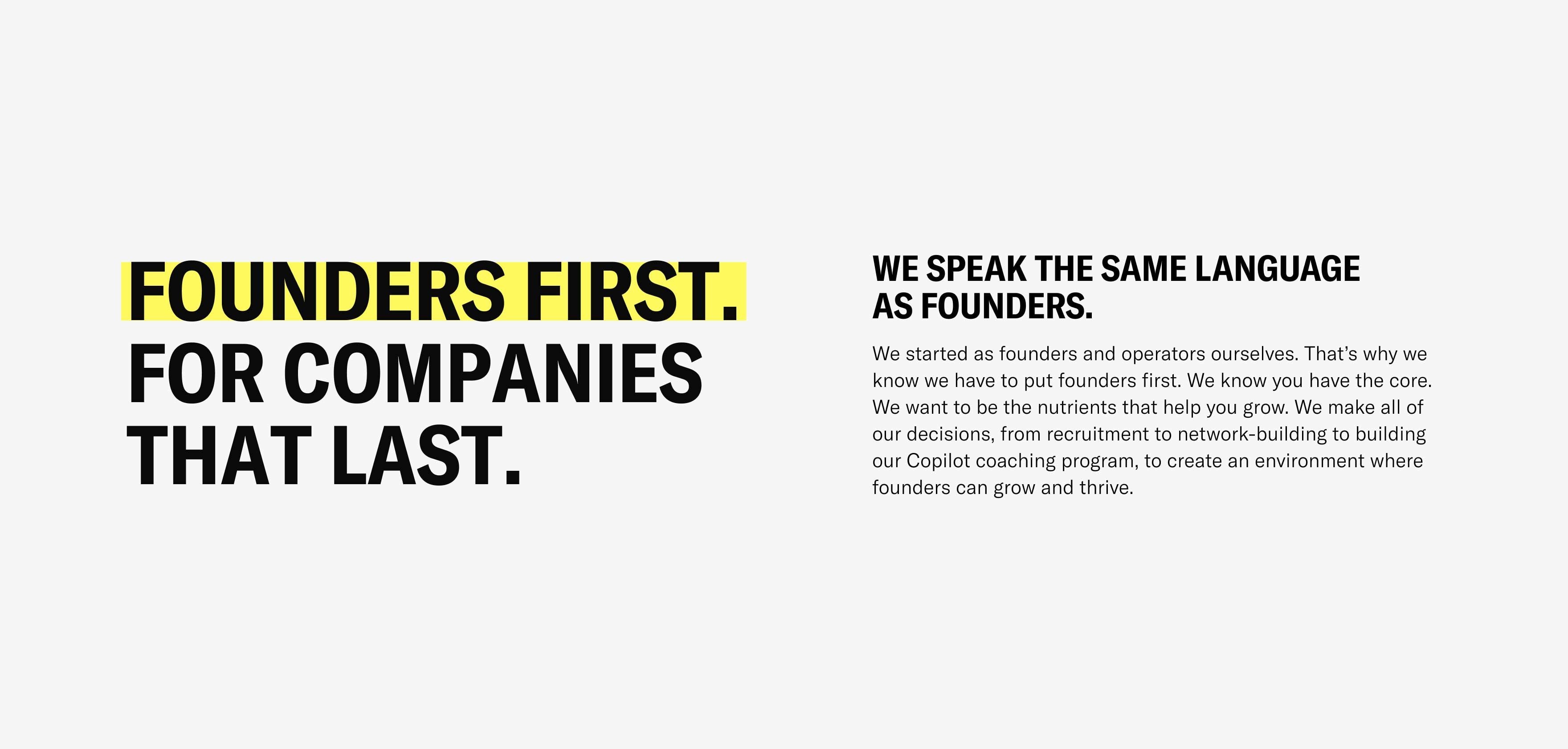
Cherry wanted to level up their brand strategically, visually, and verbally. We started from the deep end and did our research, using one-on-one interviews, desktop research, and competitor analysis as the primary methods. The findings led us to navigate a few potential directions, but eventually, all roads led to the very core of Cherry: putting founders first. Because that’s how you build companies that last – like their investors have built Spotify, Uber, and Zalando, or like their portfolio founders have built Flixbus, Tacto, and Mondu.
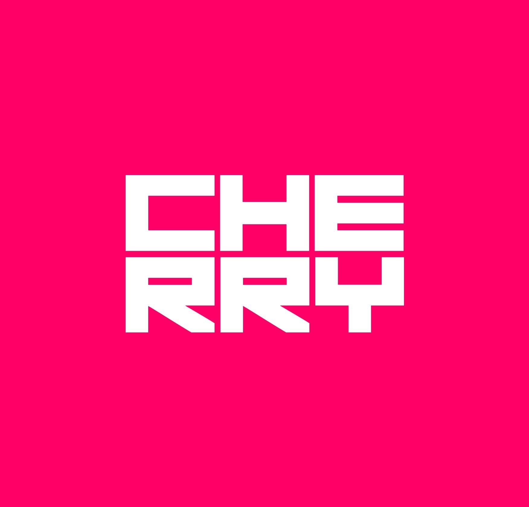
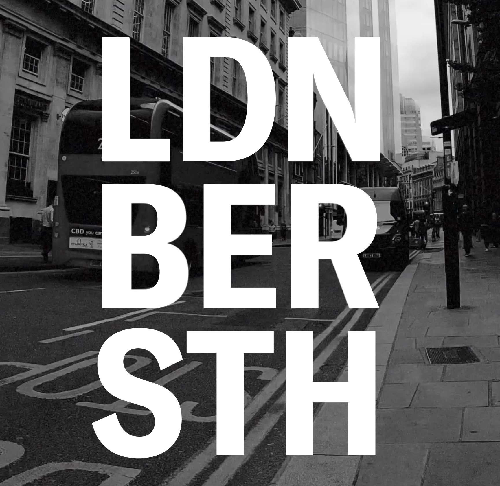
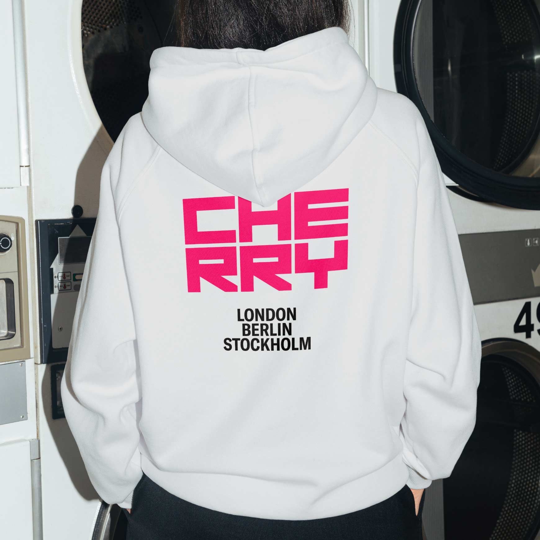
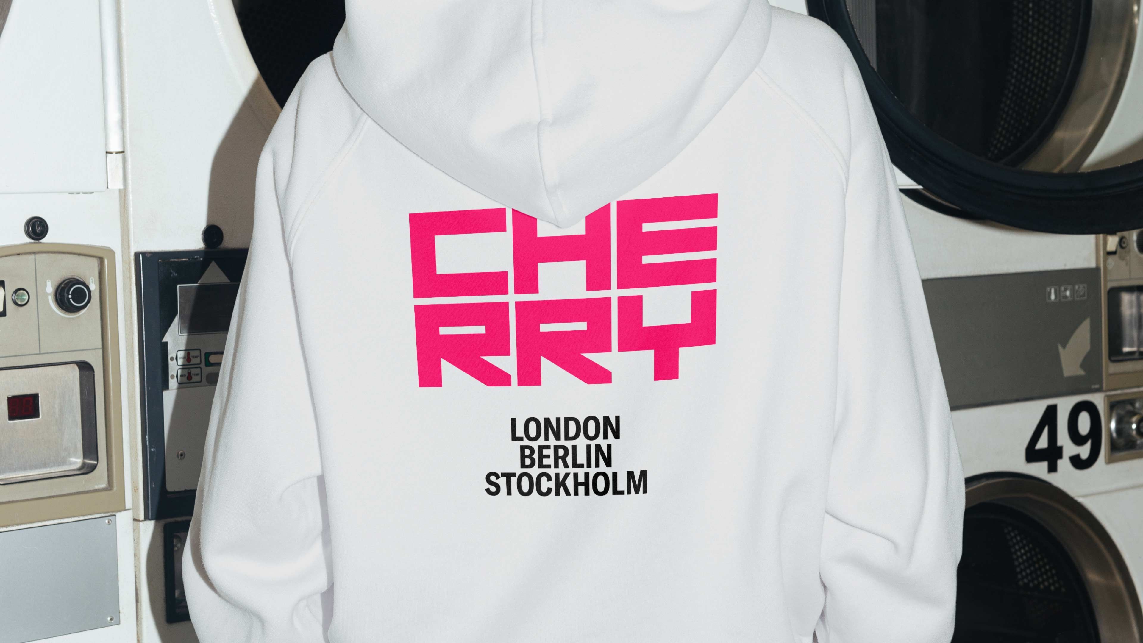
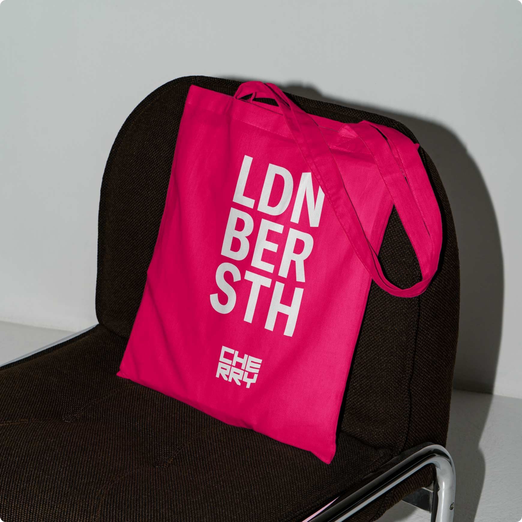
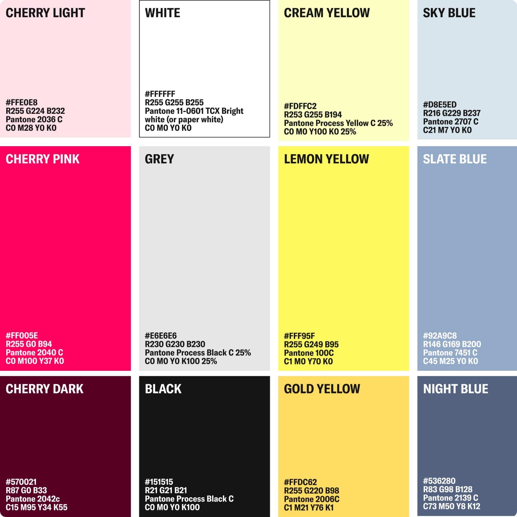
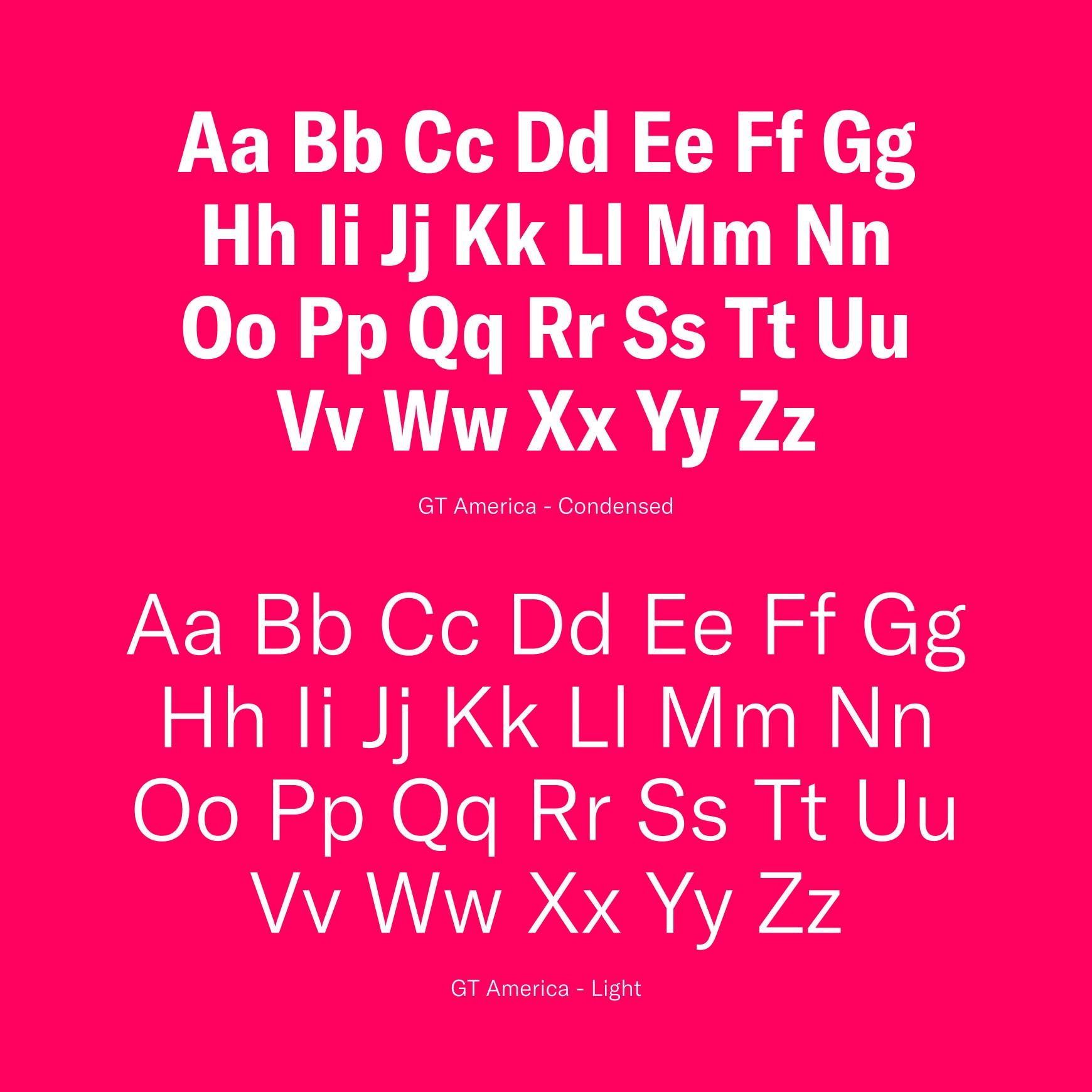
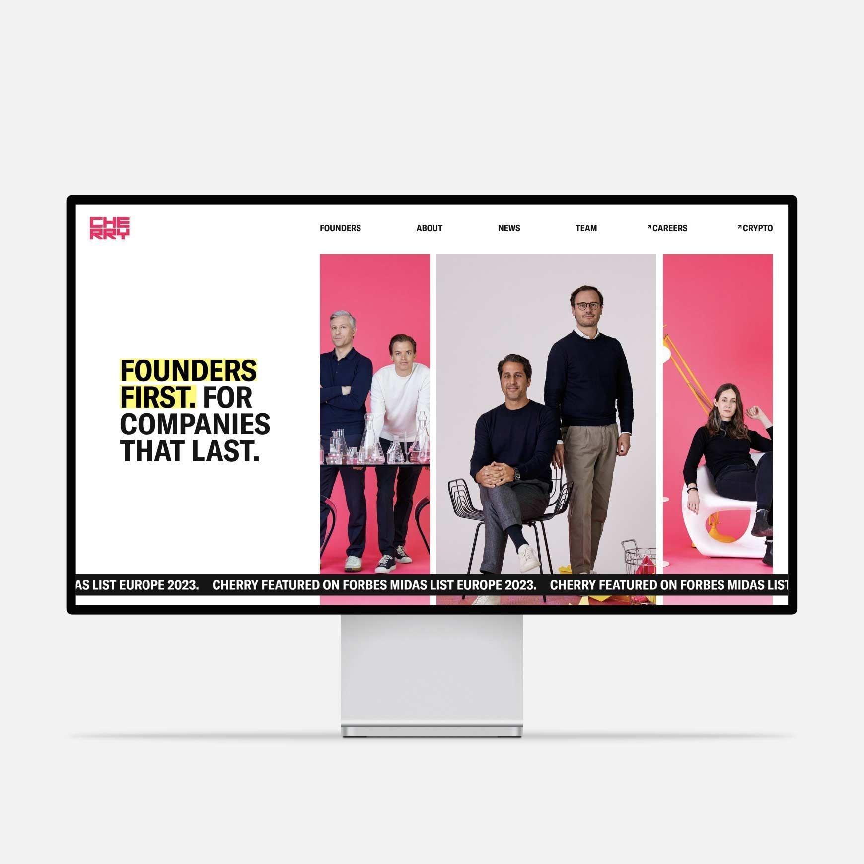
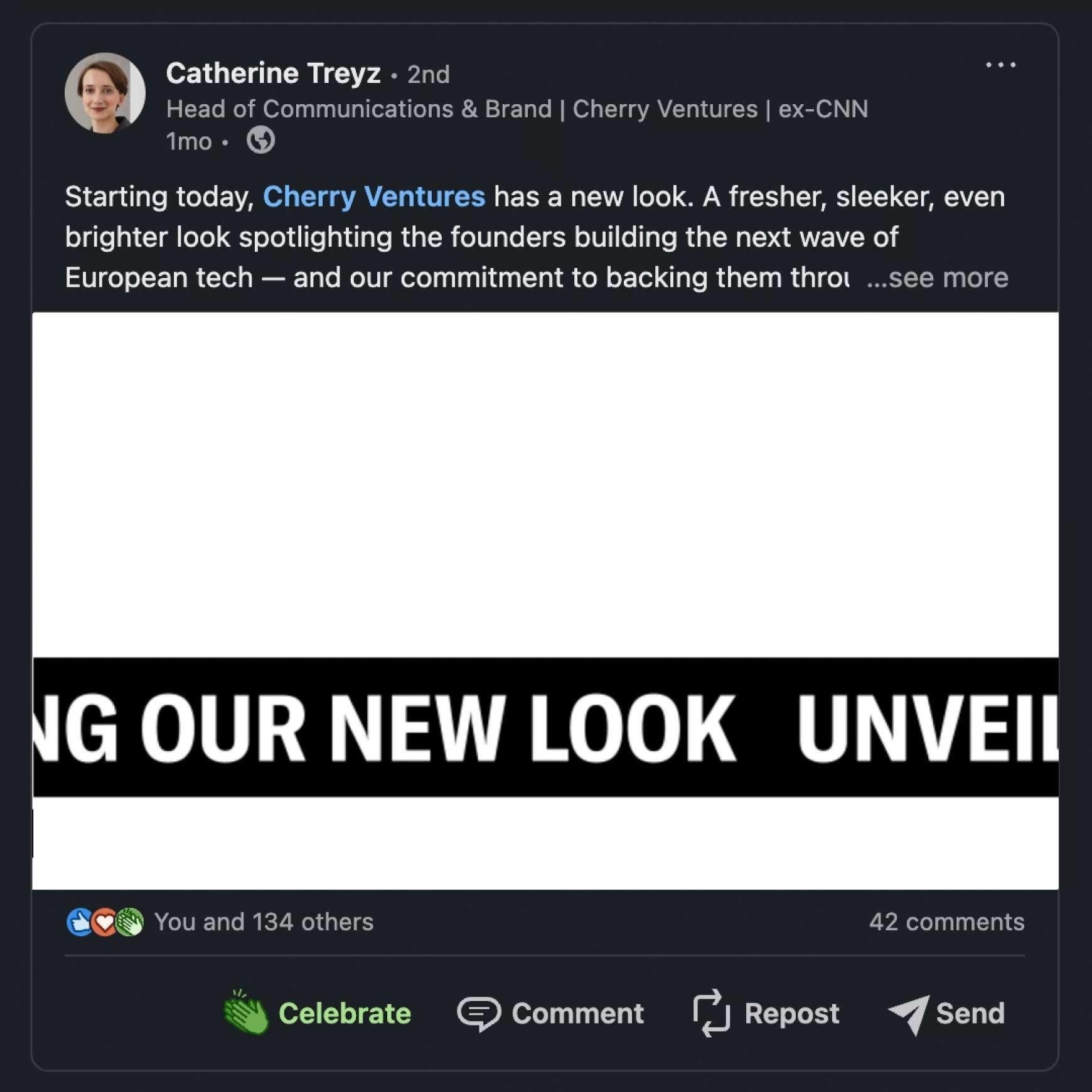
A bold, established, and Cherry-pink visual identity
The original logo serves its purpose with grace and is very dear to the Cherry team. So we didn't fix what isn't broken – instead, we gave the logo a slight glow-up, as well as designed a horizontal version to allow more versatile usage. We also kept the iconic Cherry pink at the core of the visual identity but used it more judiciously: to put the spotlight on founders. Using clear white and black as primary colors communicates establishment and gives pink more of a centerpiece role – alongside its sidekick highlighter, bright yellow. Paired with bold typography and strong contrasts, Cherry definitely makes a shiny, show-stop-confident impression.
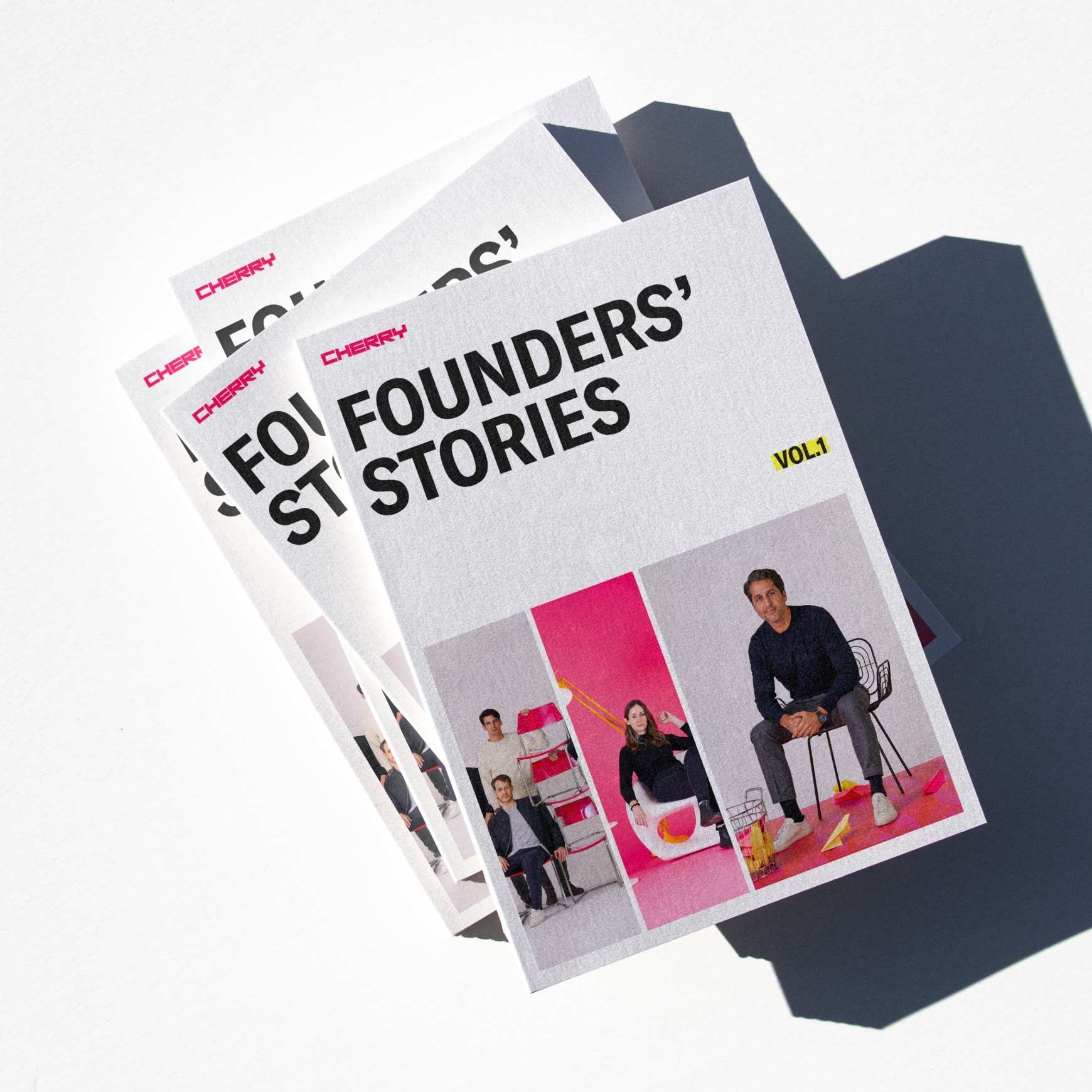
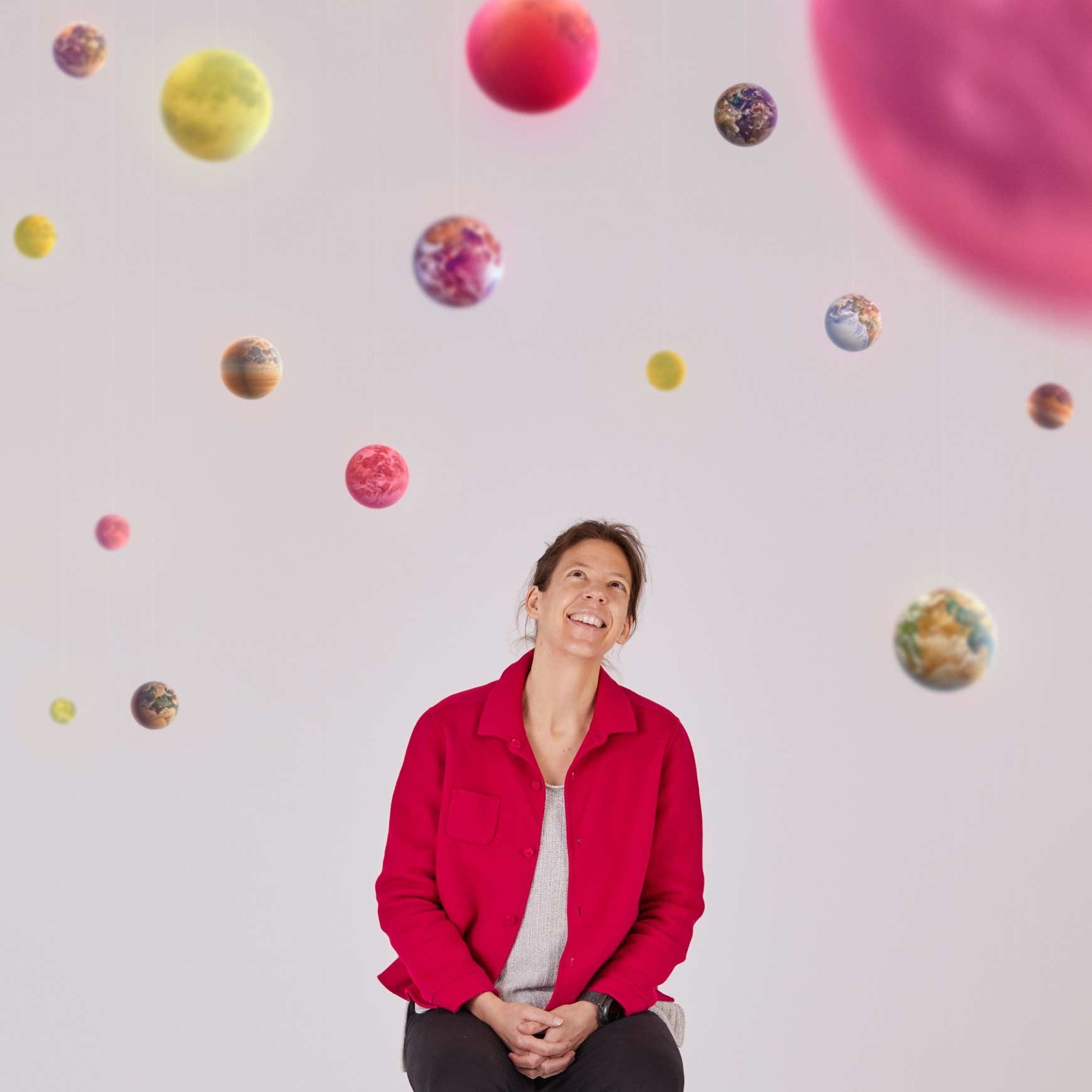
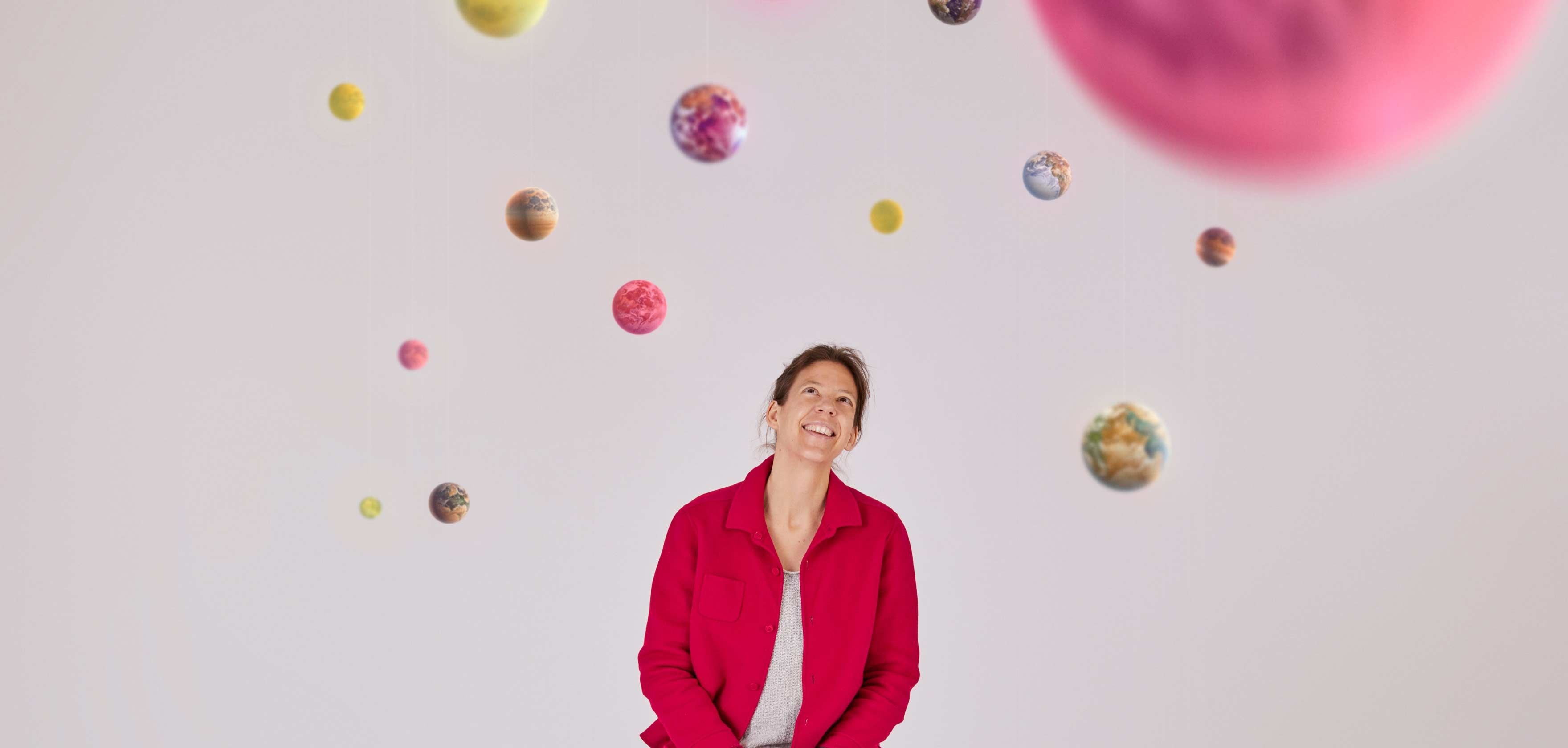
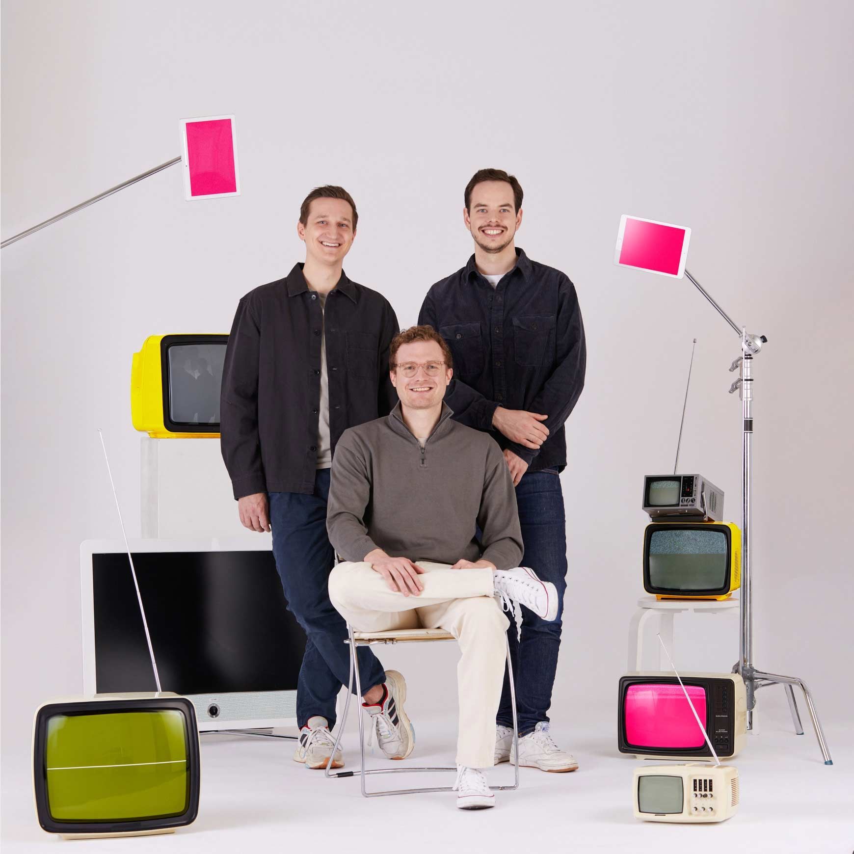
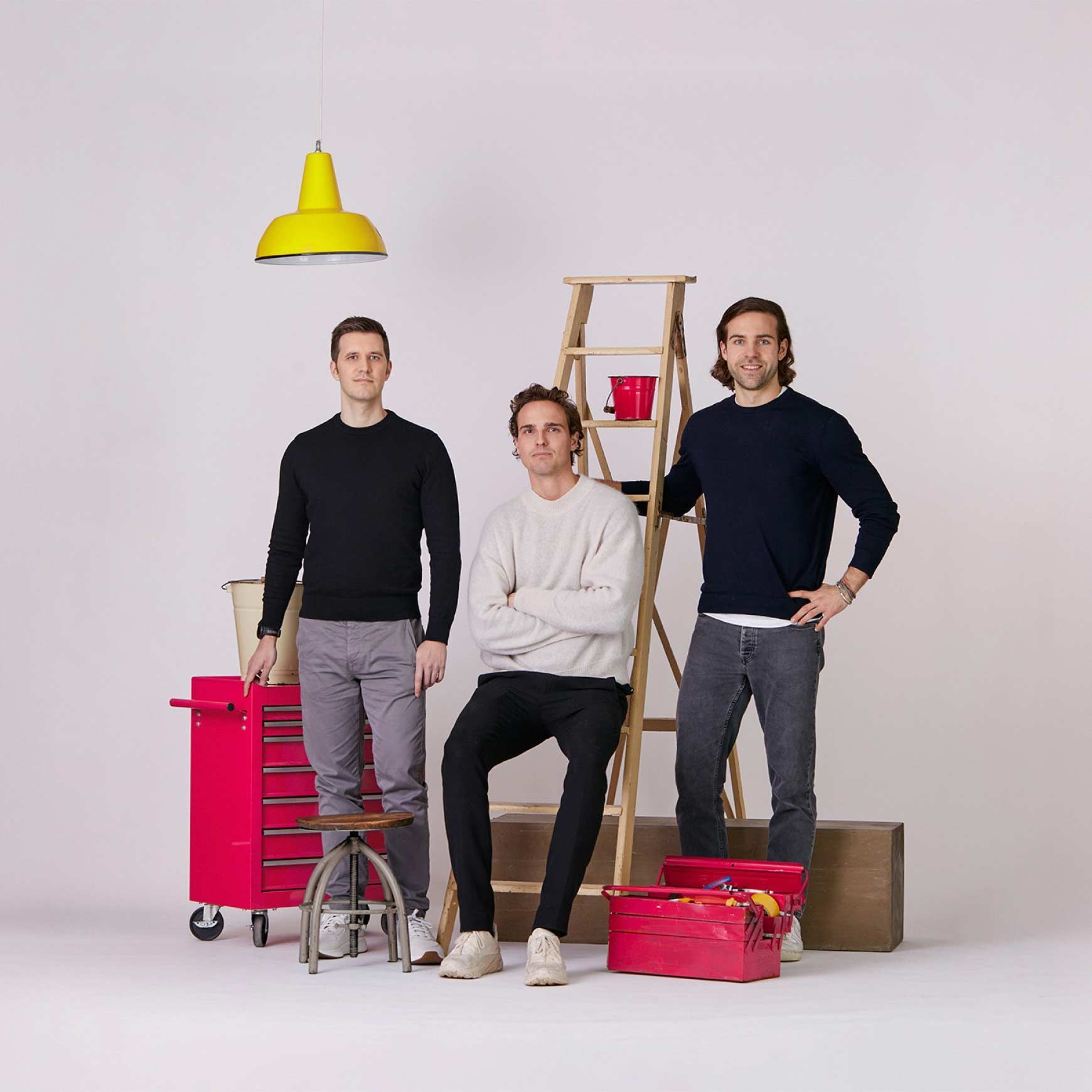
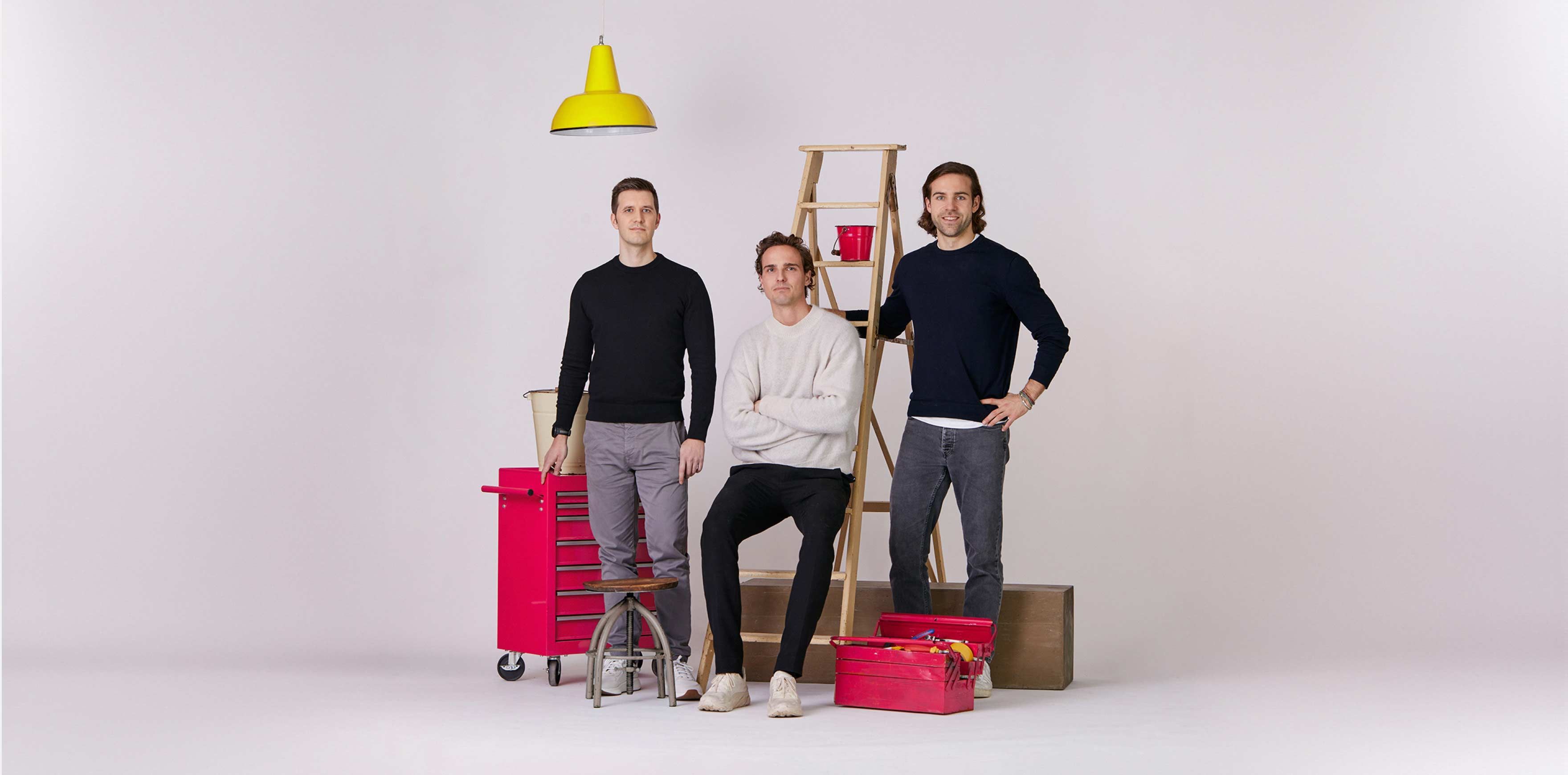
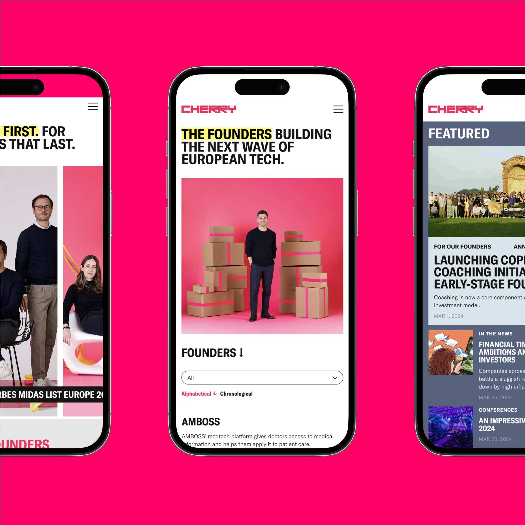
The photography concept puts founders in the frames
When we swear by putting founders first, we naturally put them in front of the flashing lights. As Cherry’s founders are scattered across Europe, we tapped into our network of 8,000+ creative freelancers from 100+ countries, and curated just the right photographers to tackle the photoshoot challenge with us. While we handled art direction and project management, they focused on capturing the founder photos just right. Say 'Cherry'—click.

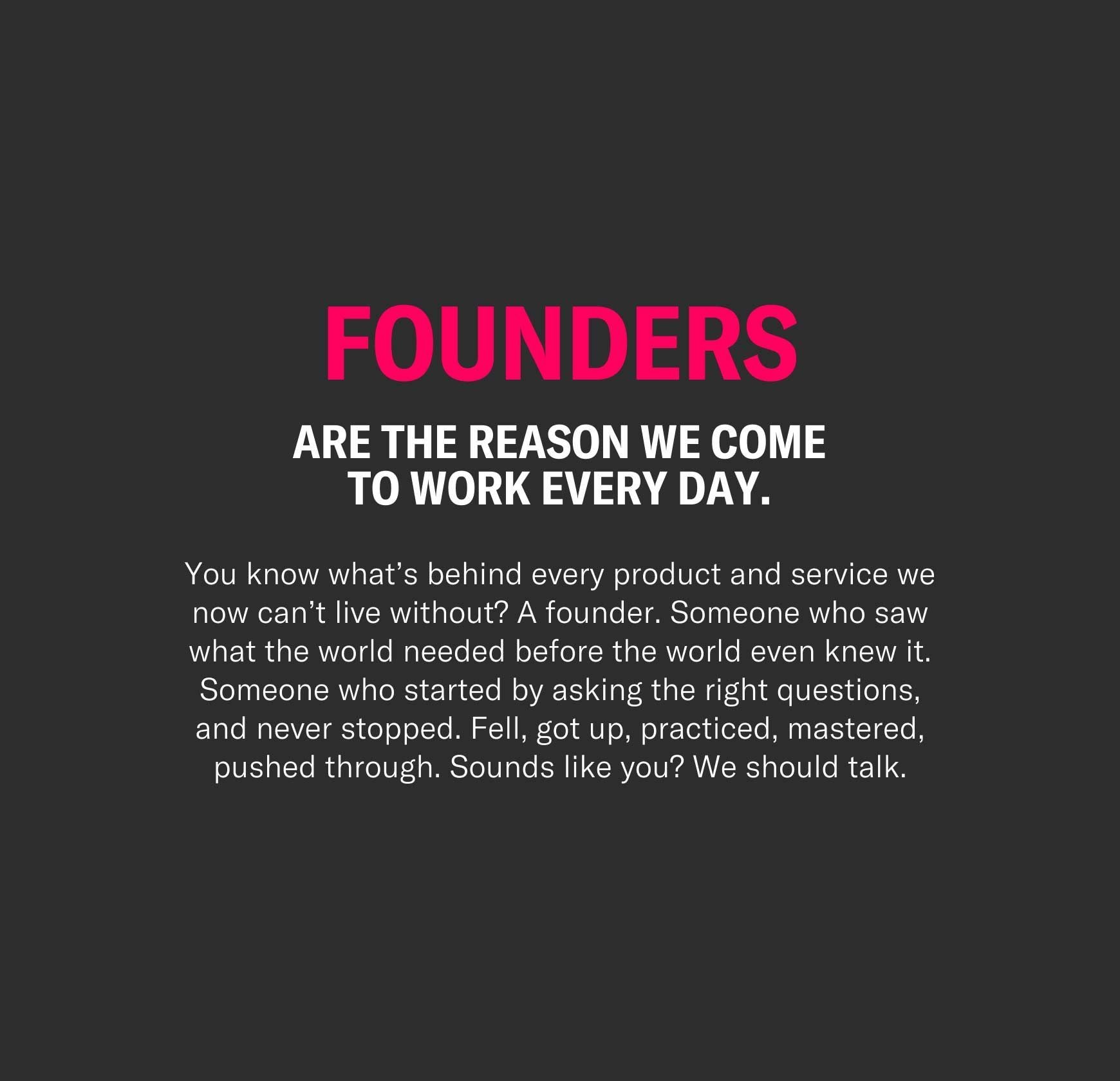
Formulating a firmly founder-focused verbal identity
“Founders first. For companies that last.” That’s a positioning statement and company slogan in one, and also the first part of Cherry’s new verbal identity we unraveled. After nailing that, we defined their selling points and key messaging that cut through the whole website and other materials – using their new, recognizable brand voice. Cherry communicates through an active, elevated, and aspirational tone, highlighting founders and the active role Cherry gives them in building the future. Pretty high-level stuff, huh? We know – and to keep Cherry's tone of voice on a concrete level, we made sure to define clear writing techniques, do’s and don’ts, a brand dictionary, and complete guidelines for writers – so that anyone in their team knows how to Cherrify their tone.
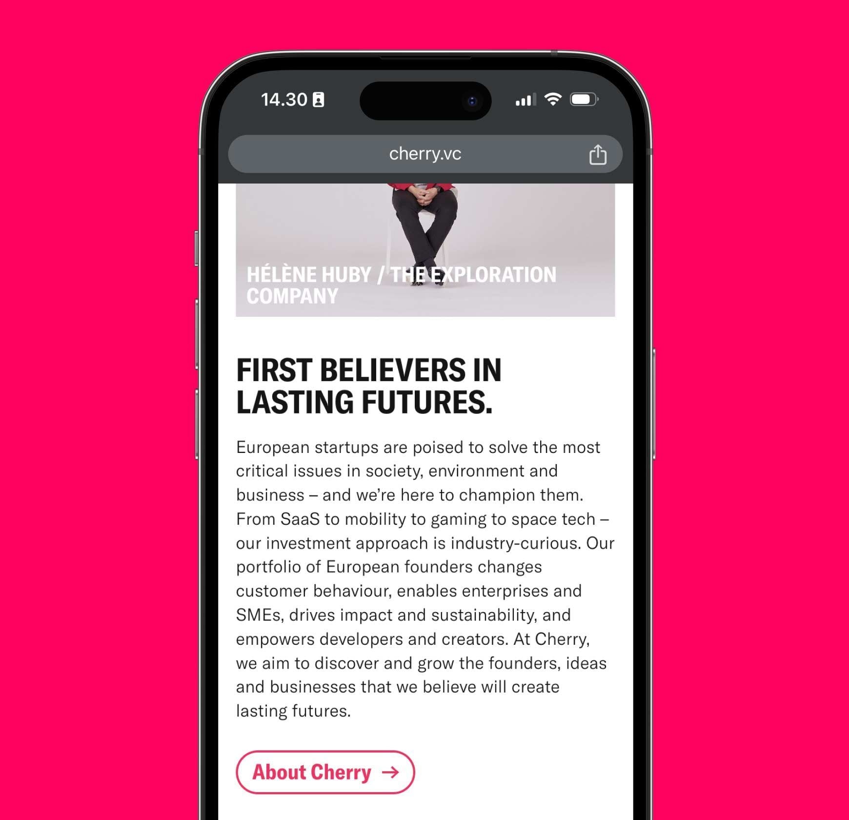
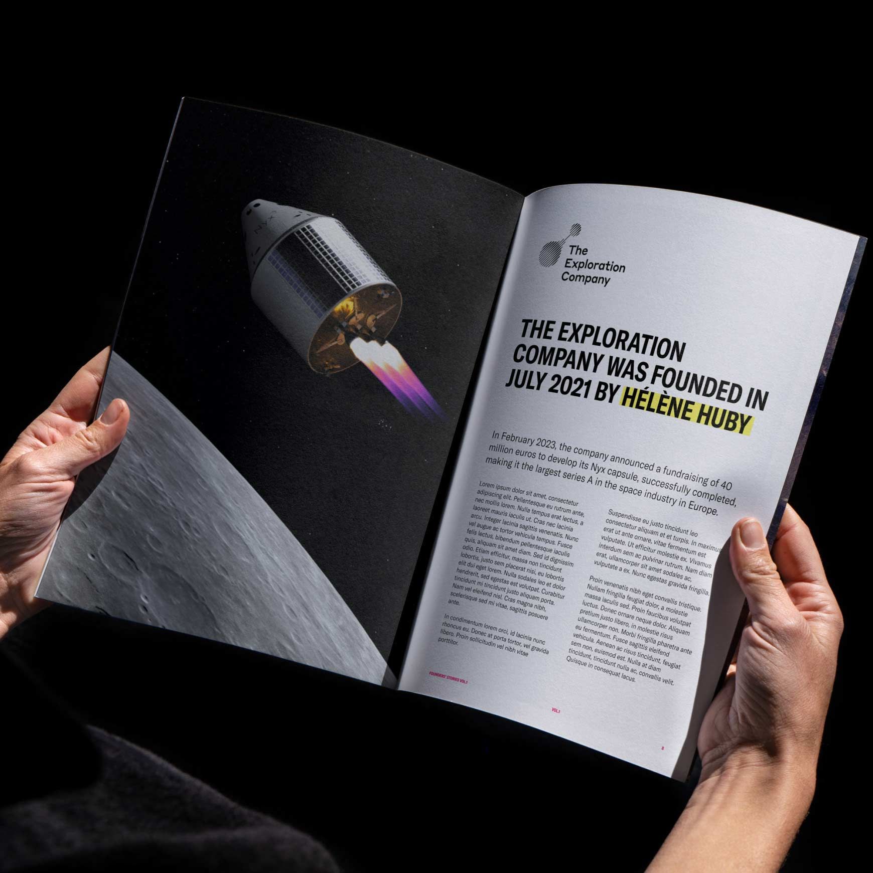
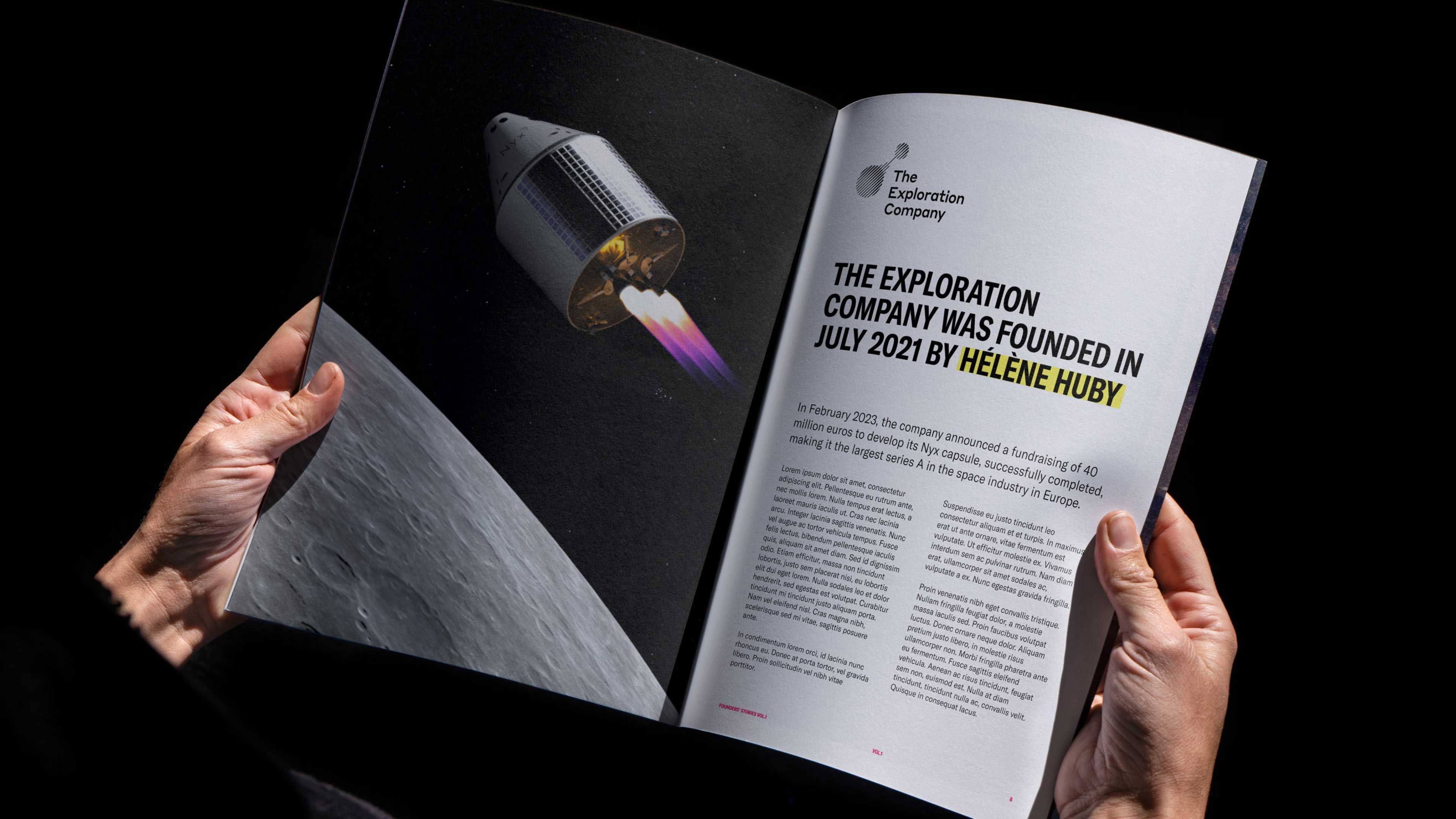
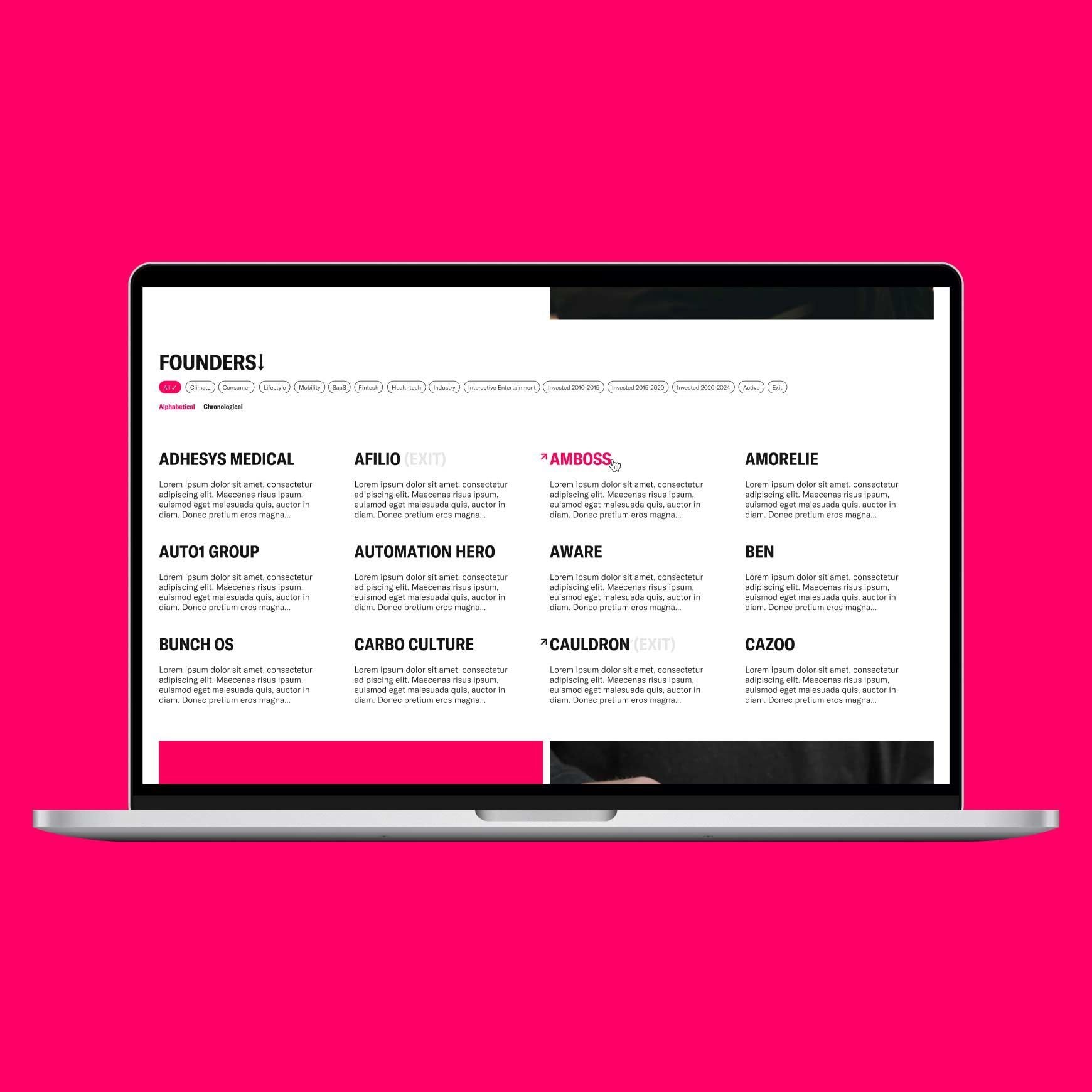
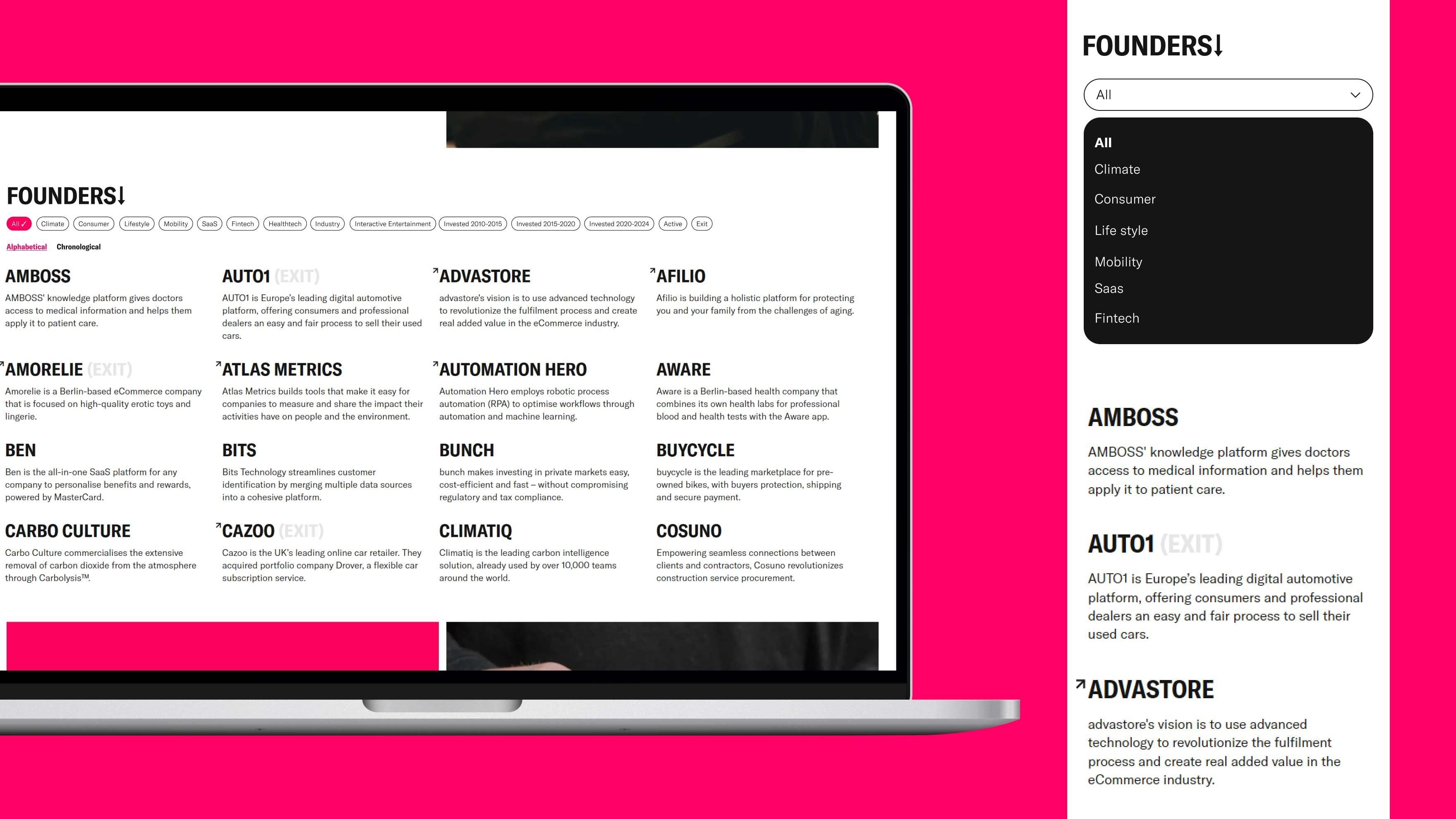
Cherry brand comes alive on a brand-new website
After defining Cherry’s new brand identity, we started applying it to different touchpoints and materials. The primary focus was on renewing Cherry’s website – from information architecture and content writing to website design and development. The new website is built with modern web technologies like Typescript, Next.js, and Sanity. The content management system is easy to use for content creators, which allows the Cherry team to update and extend the website as they keep growing.
“Just like how we put founders first, Bou puts clients first. They truly go the extra mile to meet our needs and, ultimately, became an extension of our team.”
Christian Meermann, Founding Partner at Cherry
CREDITS & CONTRIBUTIONS
Brand strategy partner: FNDR
Photography: David Kavaler and Matthew Joseph.
Retouching: Flc., Sami Hakkarainen
More work like this
All Work
Blok
The rapidly growing proptech company
Smartly.io
The leading SaaS digital ad platformLooking to collaborate?
Let the stars align and send us a message.