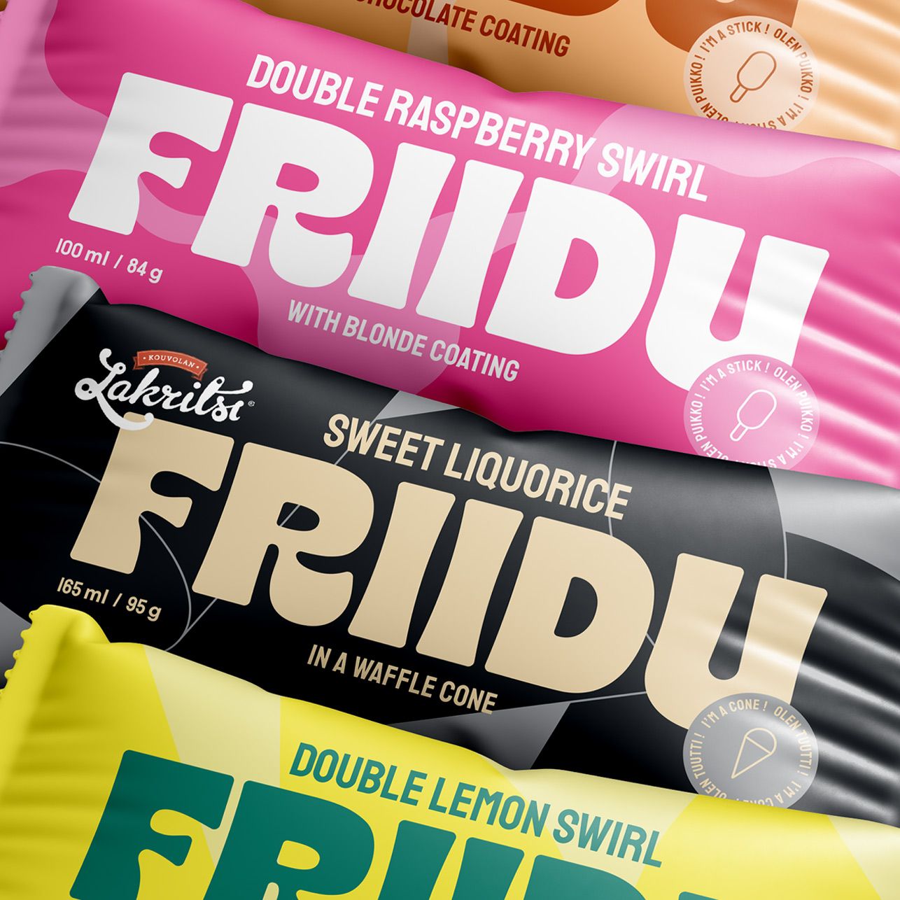
Friidu

Friidu is a plant-based ice cream company creating delicious sticks and cones with an experimental approach. Their first ice creams hit the stores in 2023 and ever since, they’ve been delighting and surprising Finnish consumers with their frozen treats. Who would’ve known broad beans could taste this good? In fall 2024, Friidu wanted to renew their packaging design to make sure that their products would stand out to anyone looking to indulge in an ice cream – not just those looking for a vegan option. We worked with their team (and their loyal TikTok fanbase) to fully renew Friidu’s packaging from design to finished print materials, and updated their visual identity including the logo, colors and patterns in the process, too.
Services
- Visual identity
- Copywriting
- Logo design
- Packaging design
- Colors
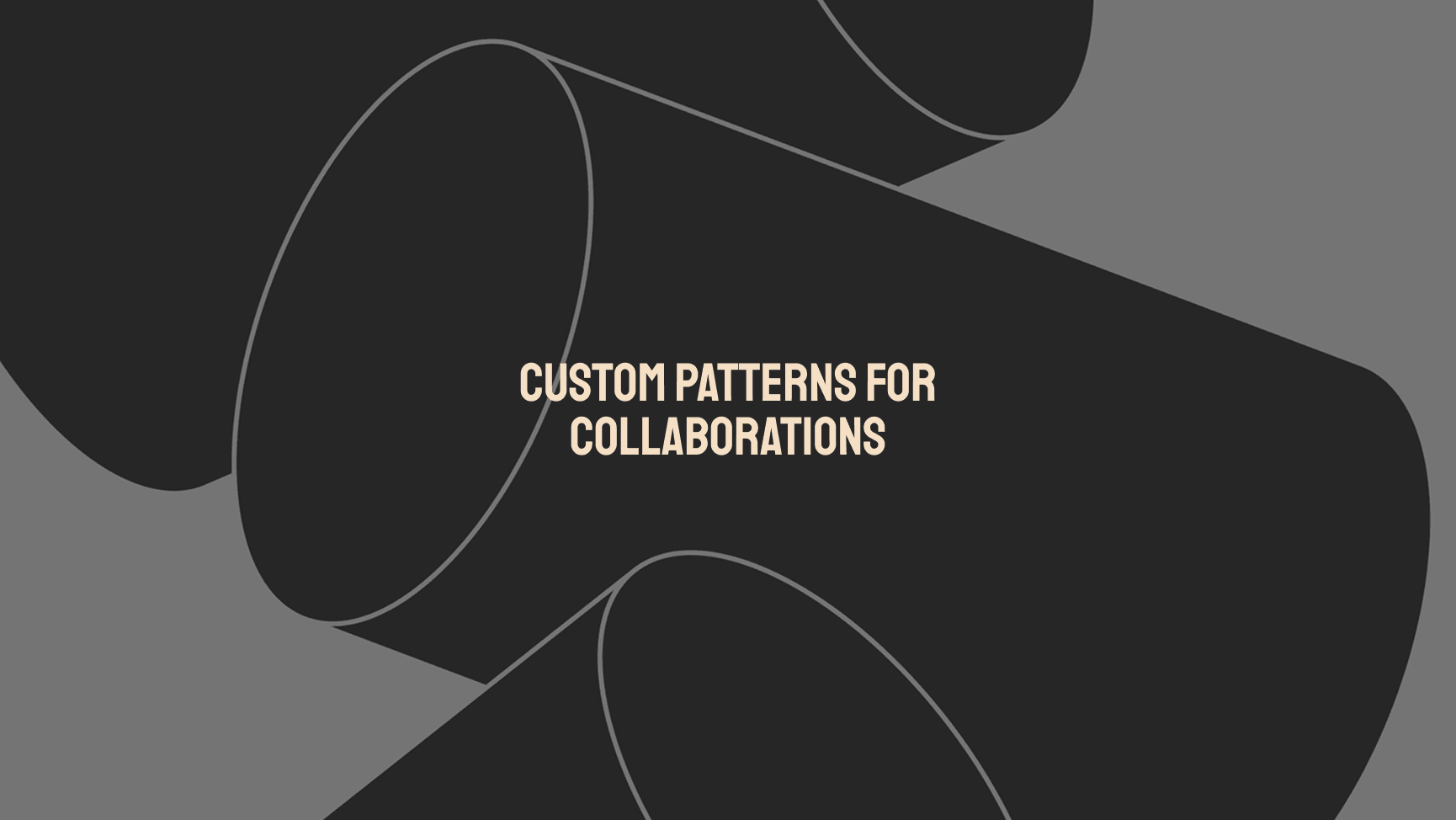
- Patterns
- Print design
Repackaging a future classic
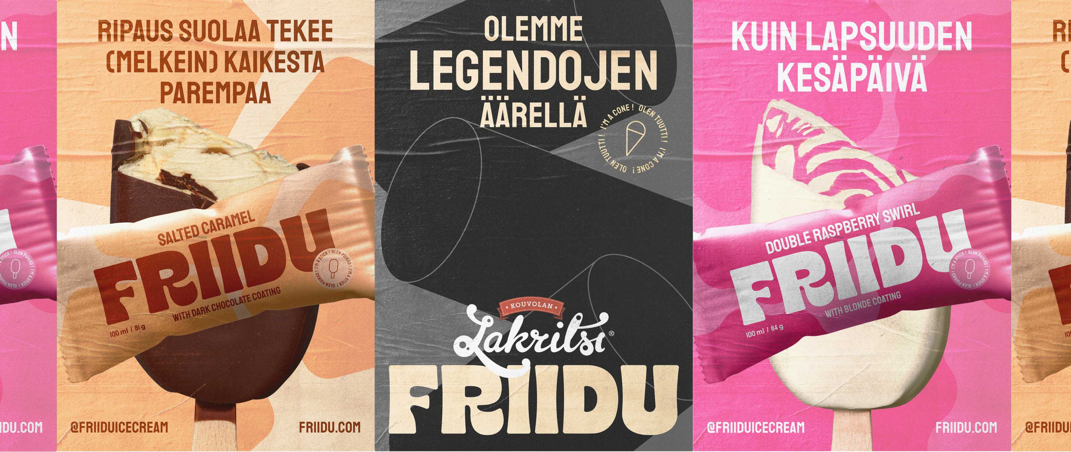
Friidu’s products were known for their vivid colors and playful prints, guaranteed to stand out in the frozen foods aisle. But their community felt that the design put unnecessary emphasis on their vegan composition, unintentionally narrowing their potential target audience. Friidu wanted their plant-basedness to be a tasty bonus, not the key selling point. They also wanted the packaging to more closely and intuitively reflect their recipes, helping consumers find their favorite flavor.
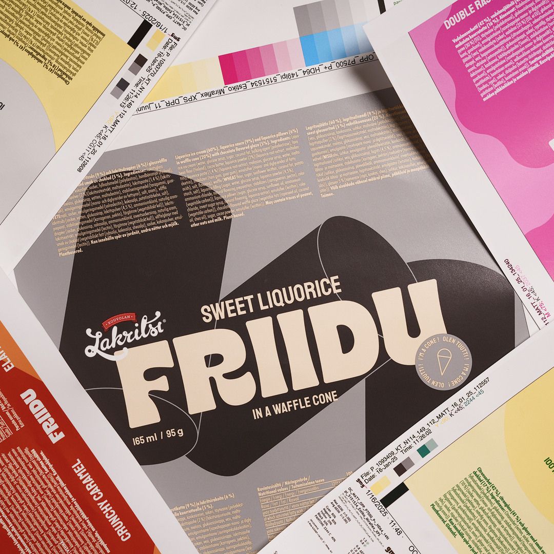
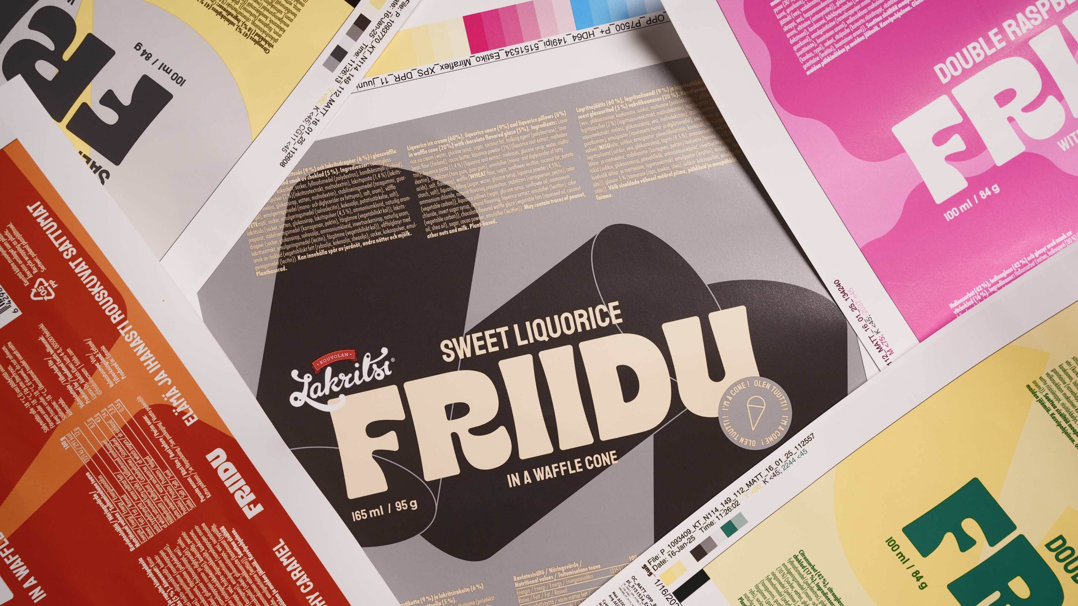
We worked closely with the Friidu team to update their packaging, opting for a more classical layout that puts Friidu’s logo front and center while maintaining the bold and playful vibe of the brand. In the process, we updated their entire visual identity including the logo, color palette and patterns to hero the flavors, while making sure that the products were still recognizable to those that had already fallen in love with Friidu’s ice creams.
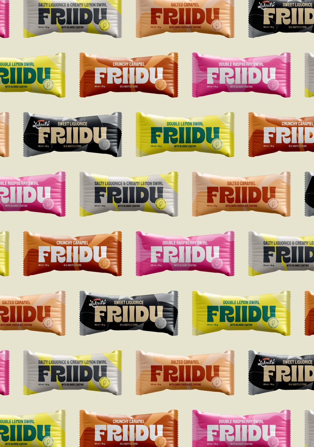
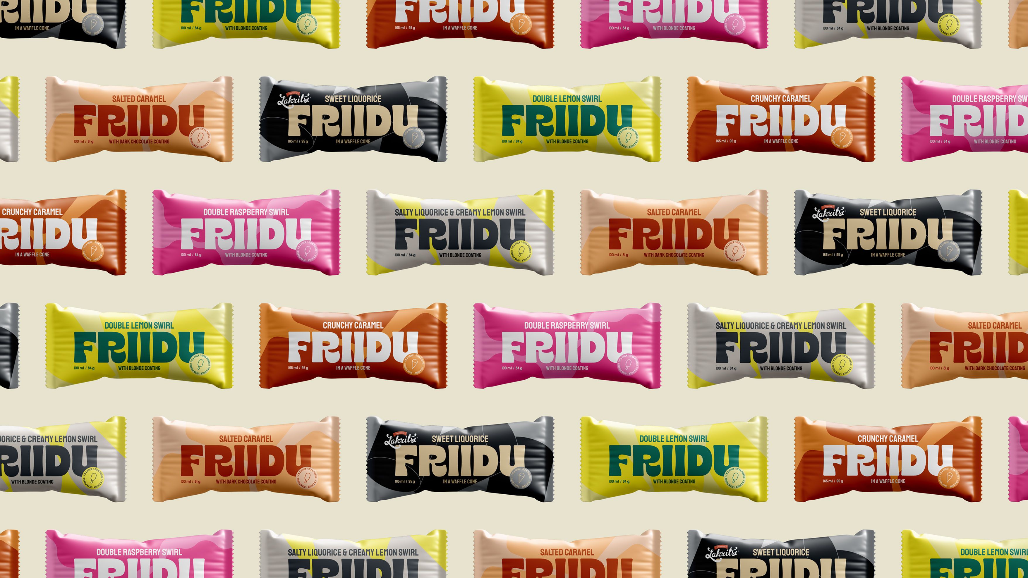
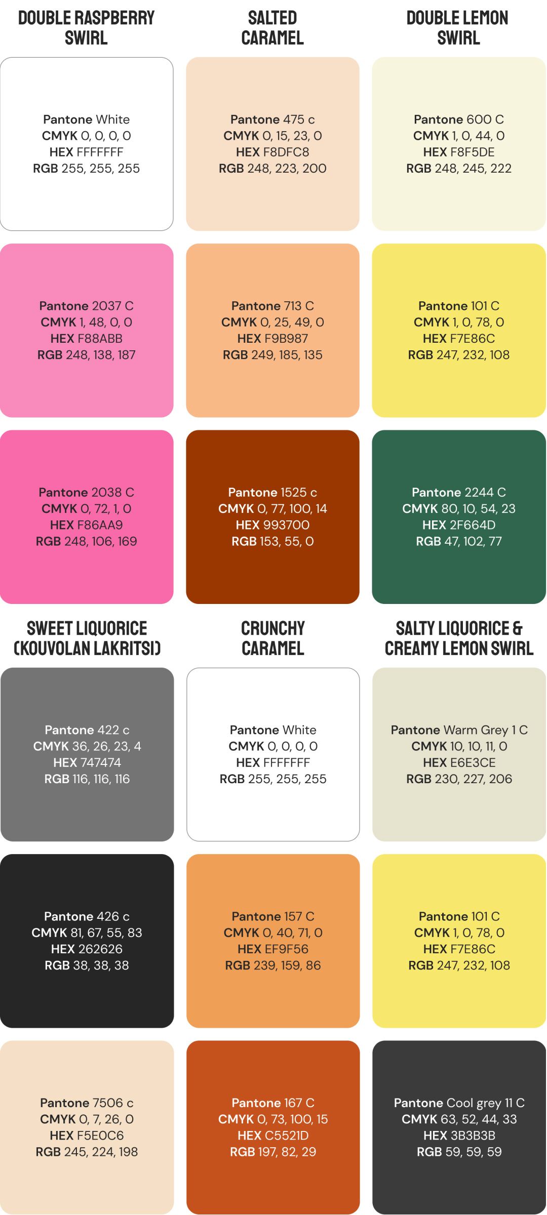
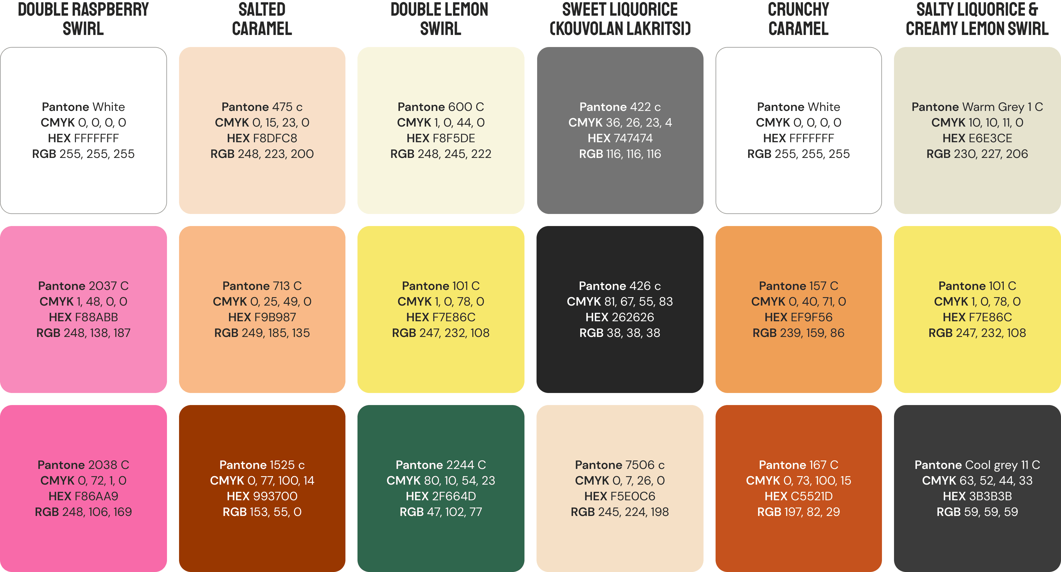
Elevating flavors with a vivid color palette and playful patterns
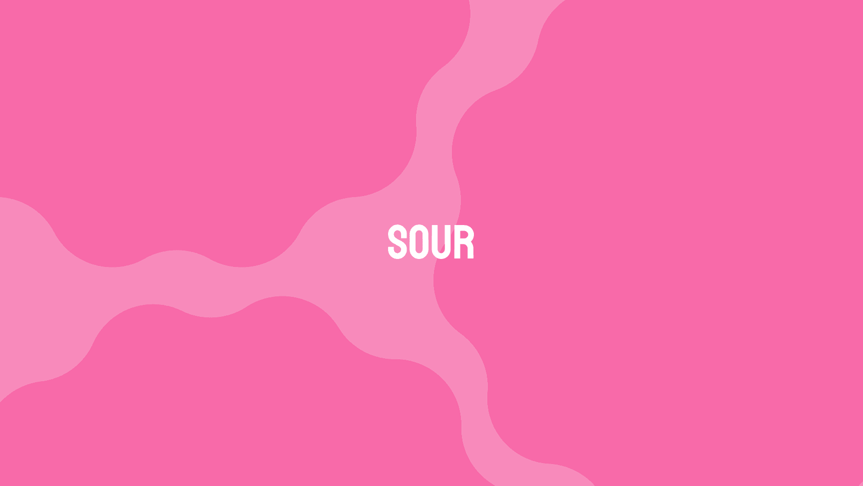
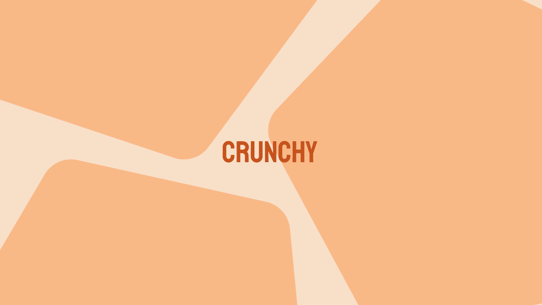
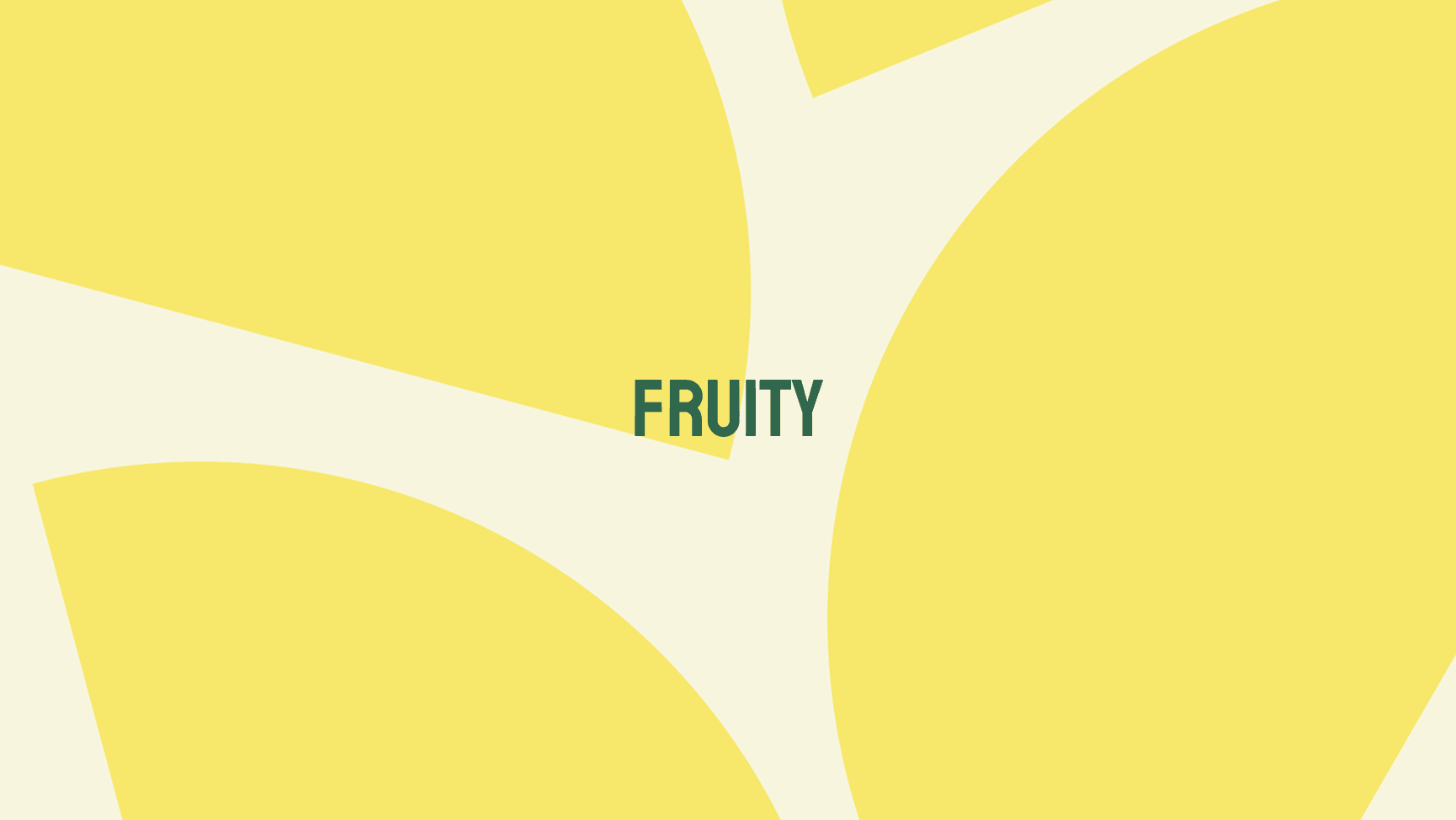
The refreshed color palette is bright and expressive: its colors are directly guided by the ice cream flavors, thus staying true to the brand while also serving the buyer. Custom geographical patterns are used to celebrate different tastes and add texture – a circle pattern to highlight sweetness, a zigzag for sourness, an angular shape for crunchiness, and a slice pattern for fruitiness, as well as bespoke patterns for brand collaborations.
While the combination of colors and patterns is playful, youthful, and expressive, it does so without compromising the main function of the product design: to help hungry consumers on their hunt for their ice cream of choice.
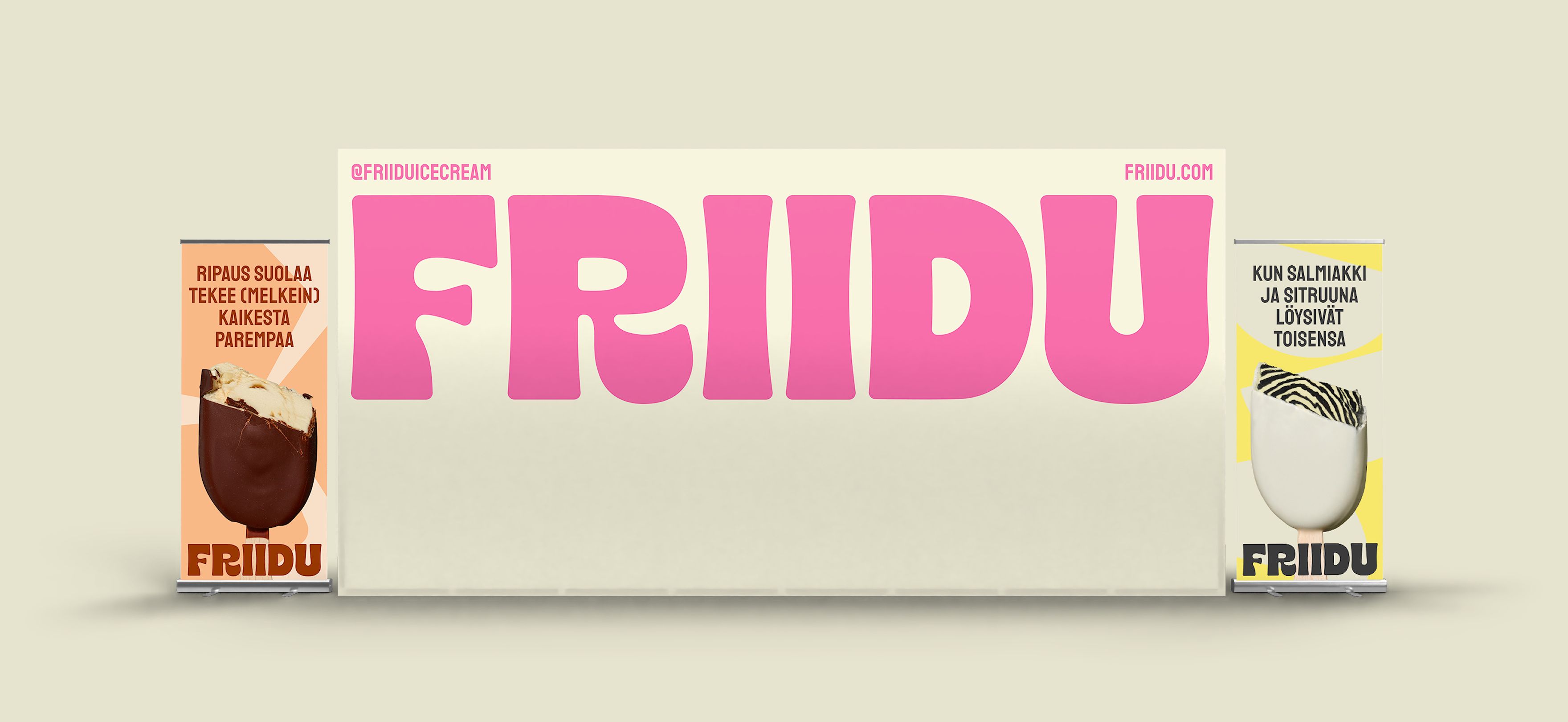
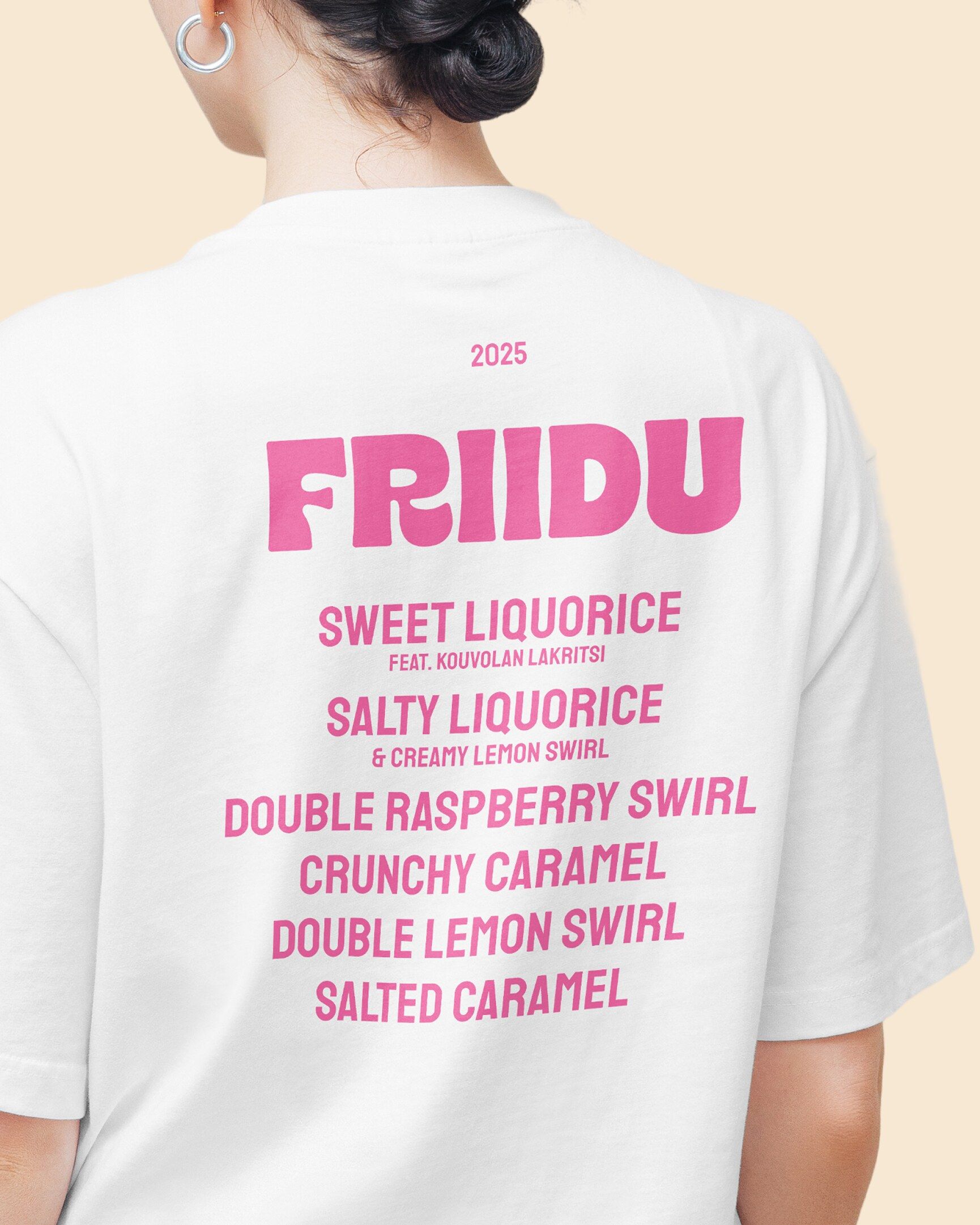
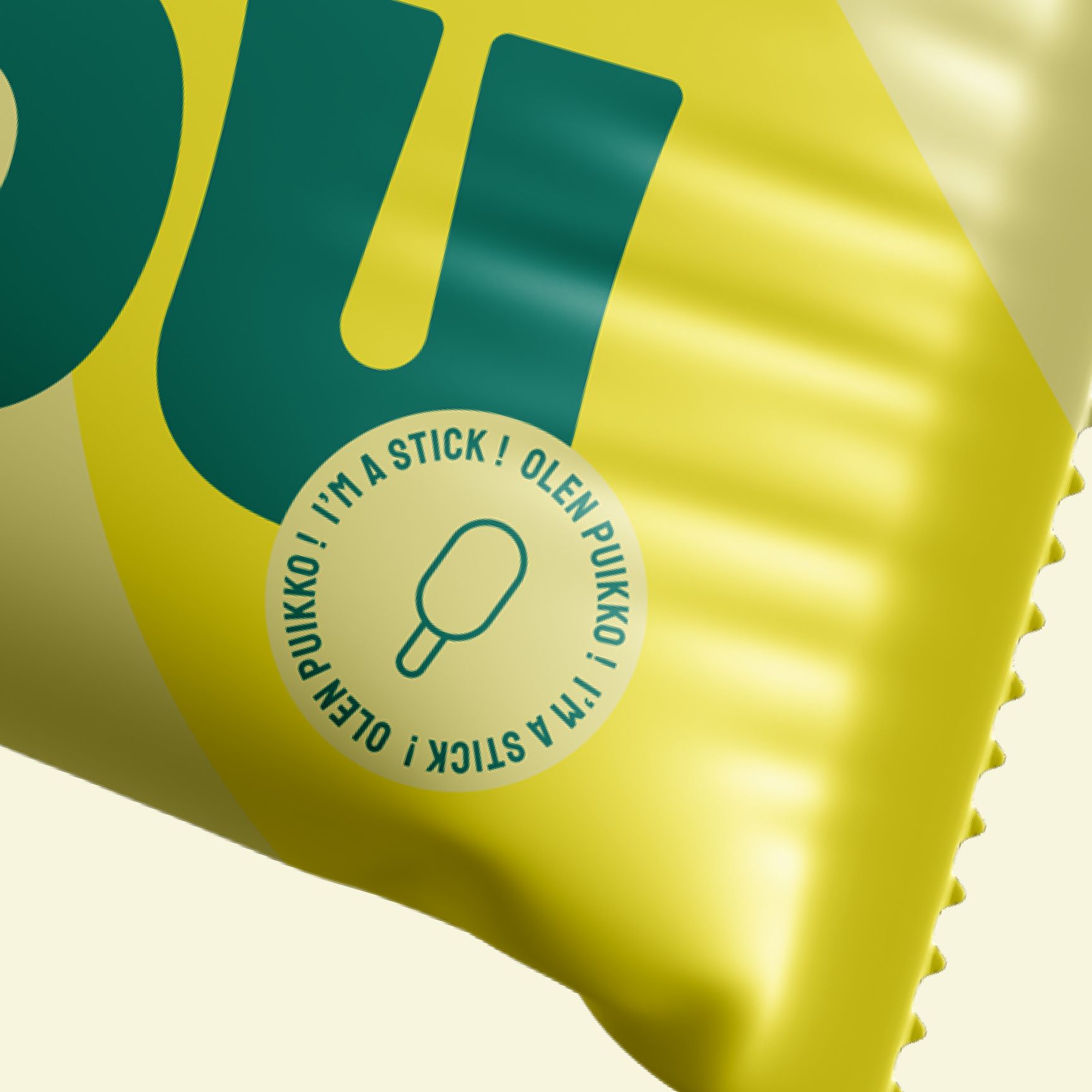
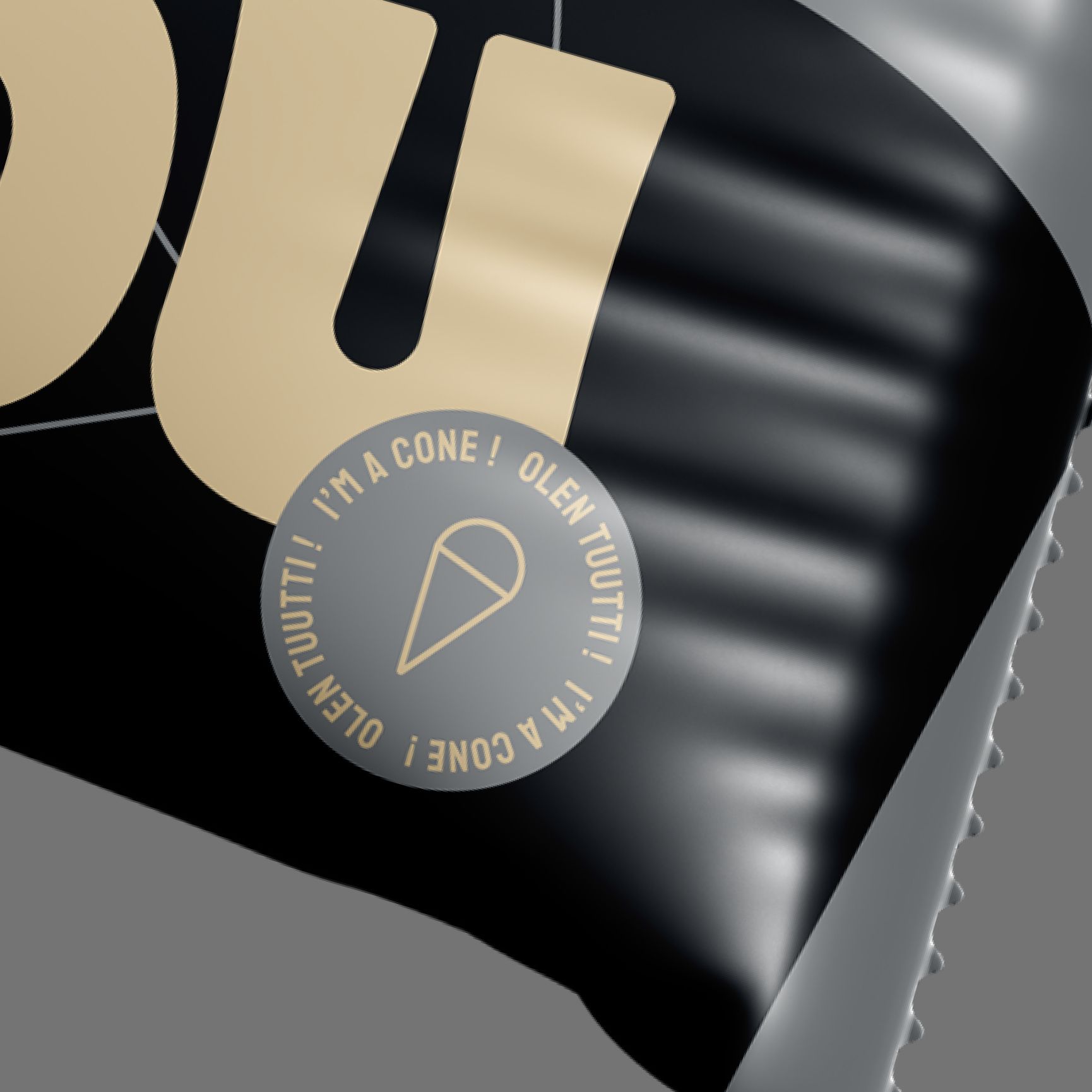
A custom typography logo and playful copywriting
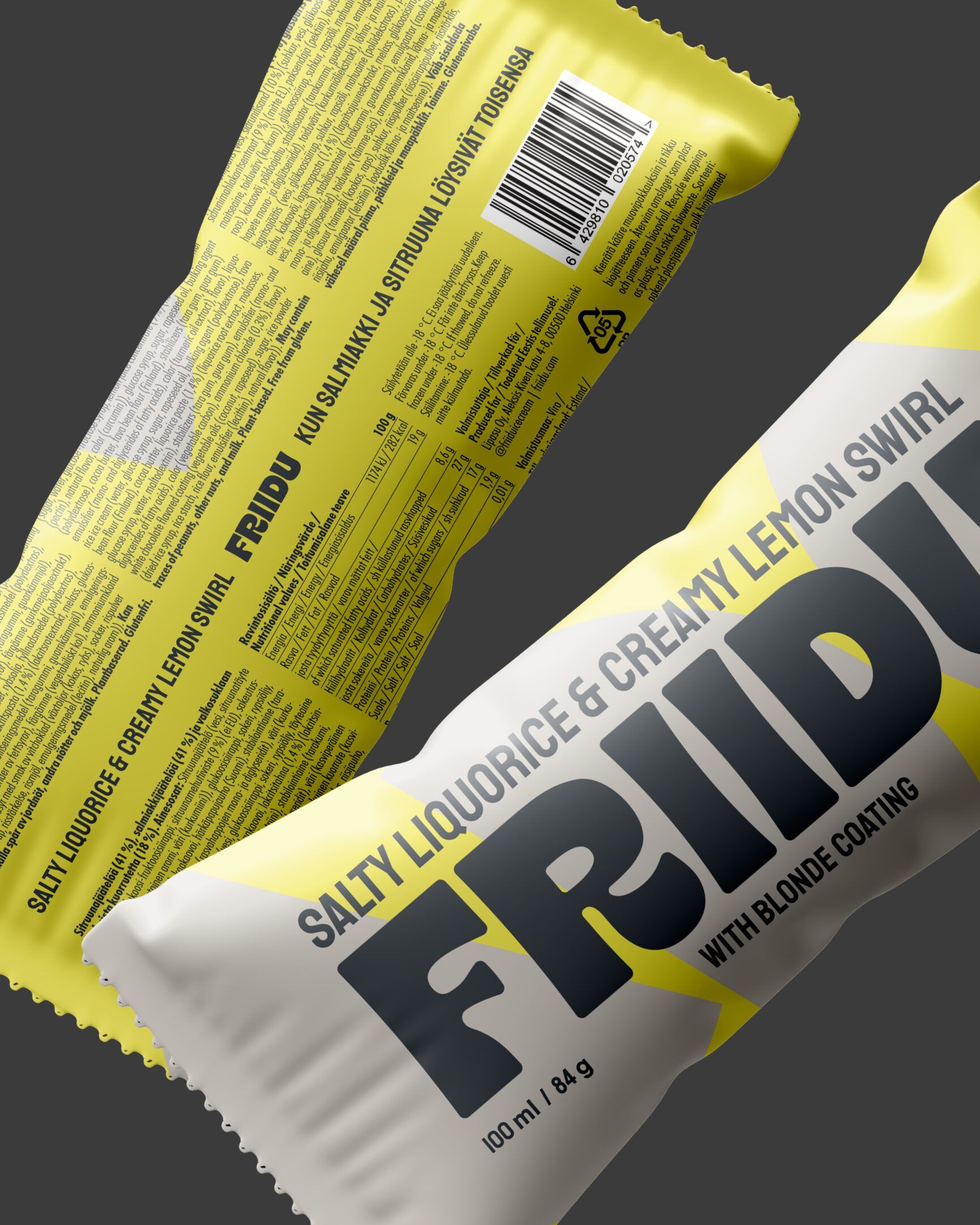
The central element of the new packages is Friidu’s logo: an expressive and bold custom typography font logo that we landed on after exploring multiple different design directions. While the all-caps font makes a bold statement, the font’s soft curvature highlights the brand’s playfulness and approachability – Friidu isn’t a brand that takes itself too seriously.
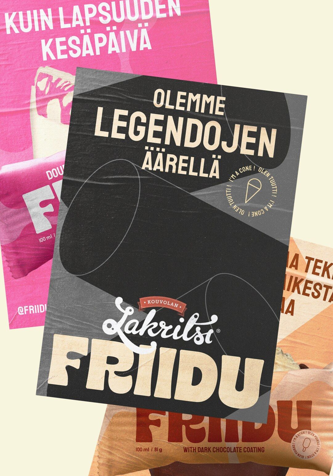
With the new logo taking center stage, we put together the finishing touches including both the fine print at the back and the tongue-in-cheek “I’m a stick” and “I’m a cone” stickers at the front of the packages. This same playful tone of voice was carried onto taglines we created to celebrate each flavor of ice cream, used in both brand and product marketing.
Bringing the identity to life
We worked closely with Friidu’s team to not only renew their visual identity and packaging design, but also bring the designs to life. Once Friidu – and their close-knit TikTok community that they regularly consulted on the brand work – were happy with the refreshed identity, we handled all of the practicalities of the printing process directly with the printing facility, including color definition and assessing print quality.
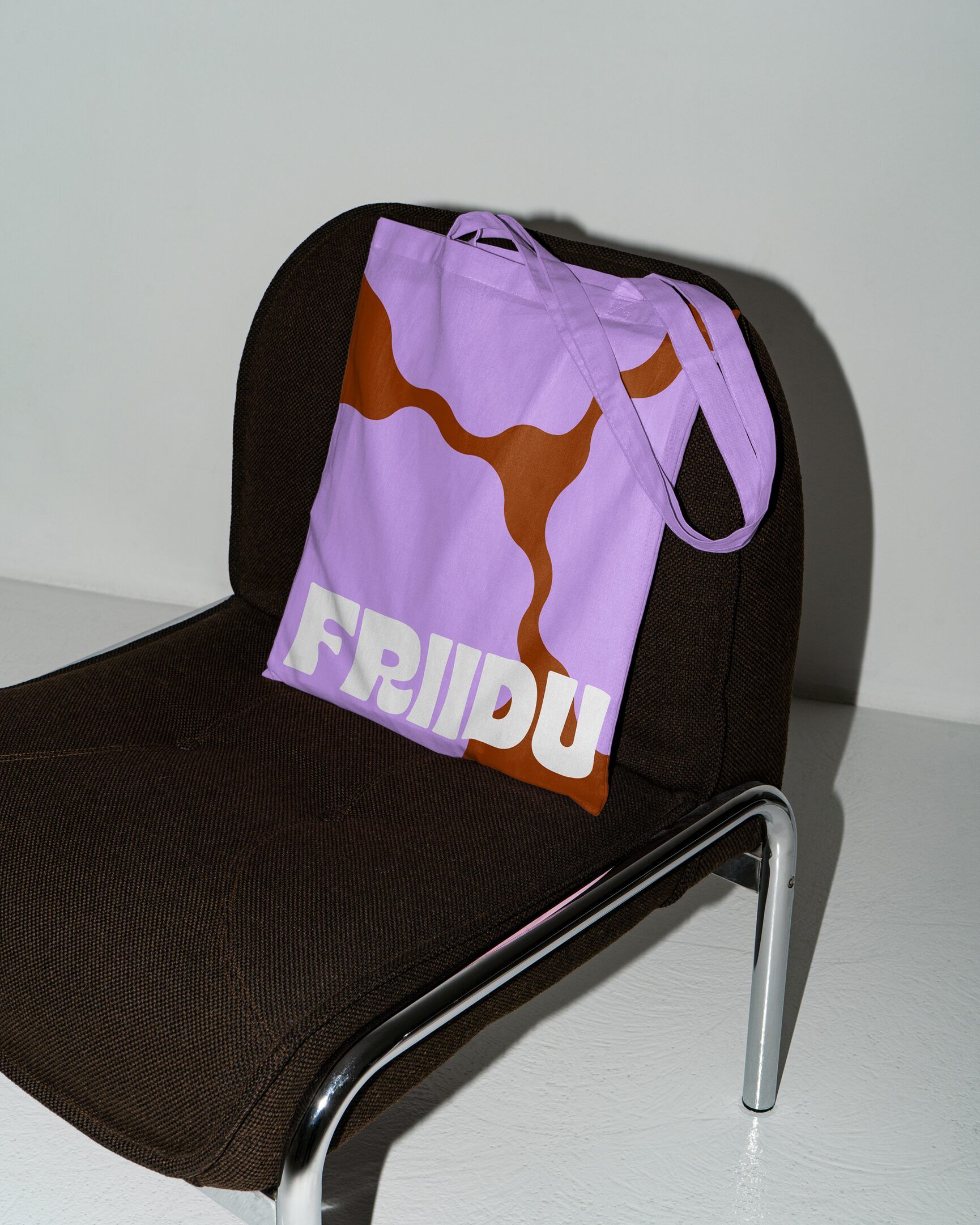
We also helped bring the new identity to new touchpoints, designing key merchandise and visual guidelines for using the brand in events and other promotional materials, reaching Friidu fans beyond the frozen food aisles.
“Working with Bou was like having an extension of our own team. Fast when we needed it, thoughtful when it mattered. The result doesn’t feel like a ‘vegan brand’, it just feels like a great brand – and it totally feels like us.”
Annika Ikonen, CO-Founder